
Contents
T-shirts are a must-have of every wardrobe, and a well-designed T-shirt can leave a long-lasting impression on your customers. But with so many t-shirt designs on the market, it can be tough to make your designs stand out from the crowd.
That’s where this blog post comes in. In this post, we’ll share some curated t-shirt design tips to help you create designs that win. We’ll cover everything from choosing the right colors and fonts to creating T-shirts that are both eye-catching and appealing to your target audience.
Pay attention to image quality
Image quality is one of the keys to a successful T-shirt design. Using high-resolution images ensures that the final print looks crisp and vibrant. On the other hand, low-resolution images may turn out pixelated or blurry when enlarged for printing, diminishing the quality and details of your design.
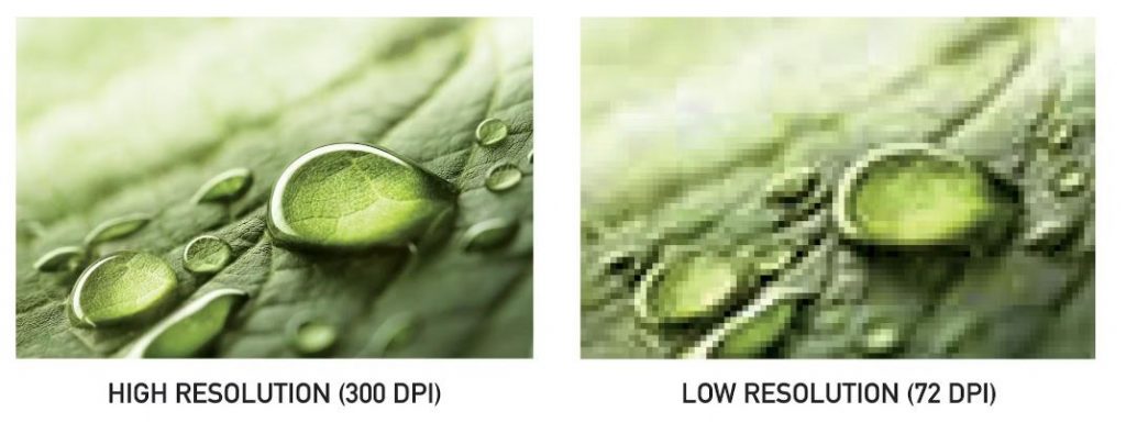
Aim for images with a resolution of at least 300 dots per inch (DPI) to ensure sharpness and detail. However, ideal image size can vary based on the printing technique and the area you want to cover on the T-shirt. For example, a size of 12×16 inches at 300 DPI is a good start for DTG Printing.
Here are some tips to help you find or adjust the image size:
- Graphic design software like Adobe Photoshop can help you adjust the resolution accordingly.
- Vector graphics files (which are typically PDF, EPS, AI, or SVG file types) can help remove the stress of low-quality pictures. When you upload a vector file, it automatically scales to print perfectly to any size without losing quality and provides the clearest and sharpest prints.
- Always scan photographs at a high resolution. If you’ve got a re-sized or re-saved copy, try to find the original version. However, if all you have is low-quality image and impossible to fix, consider applying a distressed effect to make the design look intentionally rugged, like it’s all roughed up for a cool vibe.
- Scan photographs at a high resolution for the best results. If it’s a copy that’s been resized or re-saved, try to find the original. If all you have is low quality and it’s impossible to fix, try applying a distressed effect, so it looks like it’s roughed up on purpose.
And lastly, always preview your design at the intended print size to ensure it maintains the quality and clarity needed before sending it for production!
Make your design simple and significant
With a T-shirt design, you not only have limited viewing time, but you’re usually a moving target. Moreover, the human eye can only process a certain amount of information at once, so don’t get your customers overwhelmed by stacking things on top of each other, or using weird angles and typography, or a bunch of color.
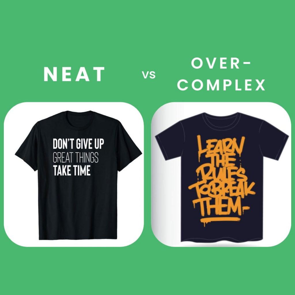
This tip can help: When designing a T-shirt, we tend to look at it close up. But most people won’t see it that way. Step back from your design and look at it from a distance, or zoom out in your graphic design software. Then fine-tune your design until it is easy to figure out what is on your shirt from that distance.
Focus on color selection
Color selection is a crucial aspect of designing eye-catching and appealing T-shirts. Not only because of budgeting (more colors means more cost per item) but also aesthetic reasons. Colors evoke emotions and convey messages, making them a powerful tool in T-shirt design, but this can backfire. Adding too many colors can overwhelm your customers, and make it difficult to mix with other items in their wardrobe.
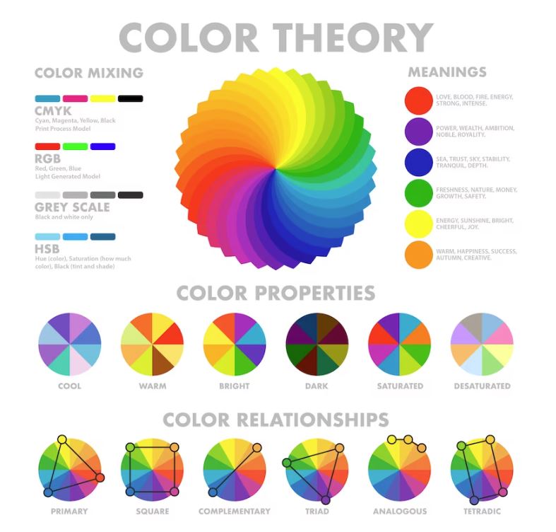
So, think about the color palette and how to combine colors effectively when you start designing. Doing research about color theory can be helpful, too. By focusing on color selection, you can create T-shirt designs that not only look visually appealing but also communicate the intended message effectively, ultimately enhancing the success of your T-shirt venture.
Mind the contrast
Contrast is a part of color choice, but it’s a specific and important part to consider. Contrast refers to the degree of difference between the darker and lighter parts used in a design. For example, bright colors on a dark background is a high-contrast.
It’s essential to have a balance of contrast to ensure that the elements in your design stand out distinctly and are easily discernible. High contrast between text or graphics and the background creates clarity and readability, making the message or image pop. On the other hand, low contrast can add subtlety and sophistication.
Careful consideration of contrast is vital, however, achieving the highest contrast possible is not always the goal. Many people like the subtle look of a low-contrast shirt. But there’s a fine line between low-contrast and no-contrast. Some common contrast mistakes include navy text on black shirts or light gray on off-white shirts. Mind the difference while playing with colors – it can make your T-shirt dull and boring.
Be careful with fonts and typography
The right fonts and typography can help your T-shirt shine. While font is a specific style or variant within a typeface family (e.g, Arial is a typeface, and Arial Bold is a font within the Arial typeface family), typography is the visual arrangement of words. Typography is about arranging type, choosing fonts, adjusting font sizes, arranging line spacing, ensuring each element goes well with each other and bringing an aesthetic overall.
Fonts and typography should match the overall theme and message of your design. For example, if you’re designing a T-shirt to celebrate Mother’s day, a Gothic font isn’t the best way to convey your message.
But don’t panic if you aren’t born to be a typography artist! We’ve got some helpful typography design tips for T-shirts:
- Never use more than three fonts in a design. It may create a chaotic vibe overall.
- The most important words should be bolded and placed at center position.
- Avoid huge text blocks. You don’t want your T-shirt to look like the side of the bus, do you?
- Using fonts with contrasting styles enhances visual interest – but don’t overdo it.
- Be careful of where to put your line breaks; they may change your message.
You can also watch this video to discover 5 simple ways to leverage your typography game.
Balance and proportion
A balanced design is a part of a visually appealing T-shirt. Balance, in its most basic form, is the arrangement of elements within a design, and no single element overwhelms the others.
There are two main types of balance: symmetrical and asymmetrical. Symmetrical balance means arranging elements evenly on either side, creating a mirror image, bringing a sense of formality and order. On the other hand, asymmetrical balance means arranging elements of different size and weight in a way that achieves balance through contrast and composition, which is often more dynamic and engaging.
Proportion, on the other hand, is about the relationship between different elements’ sizes, shapes, and amount within a design. It ensures that elements have a pleasing balance and harmony. Proper proportioning ensures that no element is in the wrong place or overwhelming in comparison to others.
Borders and edges
Borders and edges are key to enhance the visual impact and aesthetics of T-shirt designs. The use of borders can define and highlight main elements of the design, contributing to the overall look. A well-defined border can help in framing text or graphics, ensuring that they stand out prominently and are easy to catch the audience’s attention. Borders can also create a sense of cohesion and organization, guiding the viewer’s eye and giving the T-shirt a polished and finished look.
The edges of the design, whether sharp, soft, or textured, add up to the overall feel and style. While sharp edges usually convey a modern and clean look, soft or distressed edges bring a more vintage or artistic vibe.
Alternatively, you could go with more of a frame, which is a thicker border, sometimes with beveled edges or fancy details. For example, if you’re designing a T-shirt celebrating an anniversary, consider using an elegant frame. For a company shirt, something neat and professional-looking would work.
We’ve got a handy tutorial to help you create the perfect frame, check it out!
Select the right materials
Choosing the right material is important for your T-shirt to look good and feel good. The suitable material can complement the design and maintain its visual appeal even after many washes. It can also enhance the overall wearer experience, contributing to customer satisfaction.
It’s important to note that different fabrics come with different characteristics that can affect your design. Let’s discover the most common T-shirt fabrics below:
Cotton
Cotton is a top pick for its softness, breathability, and absorbency. It brings a comfortable fit and goes well with a wide range of designs. However, complex designs may not show up as vibrantly on cotton compared to polyester.
Polyester
Polyester is famous for its persistence, quick-drying, and vibrant color reproduction. Designs tend to look sharp and vivid on polyester, making it a great choice for detailed or colorful printings. However, polyester may not be as cozy or breathable as natural fabrics.
Blends (Cotton-Polyester, Tri-blend)
Blended fabrics combine the advantages of both cotton and polyester. For example, cotton-polyester blends offer a balance between softness and durability. Tri-blends (which usually consist of cotton, polyester, and rayon) brings a soft feel, durability, and a vintage look.
Bamboo
Bamboo fabric, derived from bamboo grass, is becoming more popular for its eco-friendliness and comfort. It’s exceptionally soft, quick-drying and breathable, making bamboo fabric perfect for sustainable and comfy T-shirts.
Choose the right printing technique
Different printing techniques go with different types of fabric, ensuring the durability and comfortability for the wearer. Let’s take a closer look at the top 3 most popular T-shirt printing methods:
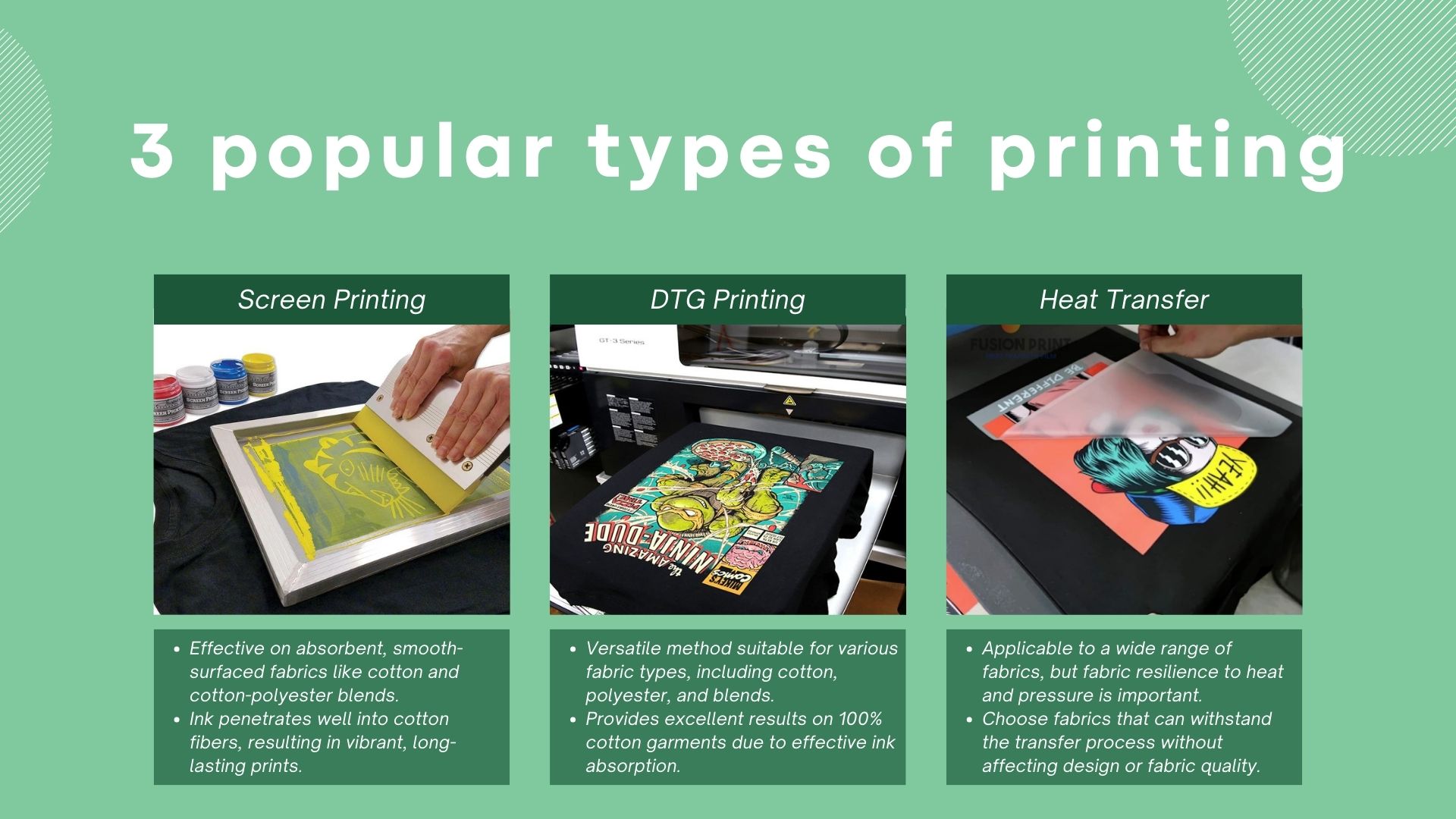
Screen Printing
Screen printing works well on cotton and cotton-polyester blends due to the fabric’s absorbency and smooth surface. Cotton allows the ink to penetrate effectively, resulting in vibrant and long-lasting prints.
Direct-to-Garment (DTG) Printing
DTG printing is versatile and can be used on various fabric types, including cotton, polyester, and blends. However, it tends to bring excellent results on 100% cotton garments, as the ink absorbs well into the fibers.
Heat Transfer
Heat transfer can be used on most fabrics, but it’s important to choose a fabric that can withstand the heat and pressure of the transfer process without compromising the design or quality of the material.
You can also check out this article for a detailed explanation of different types of printing to make T-shirts with.
Your product quality matters
When it comes to making your T-shirt designs, partnering with a trusted supplier like Merchize can be a total game-changer. Our all-in-one service makes the material, printing and delivery easy, letting the artist do their magic. Merchize helps thousands of sellers worldwide to bring their design to life on awesome T-shirts and other clothes, making sure you get a top-notch result for your designs.
In closing
A successful T-shirt venture involves a combination of creativity, knowing what’s hot, and know-how. By following these tips and continuously improving your design skills, you can create compelling and appealing T-shirt designs that catch your audience’s attention and set your brand apart in the market.


