
Contents
- Do colors really matter when designing gifts for Father’s Day?
- Why do many Father’s Day products often use familiar tones such as blue, brown, or black?
- And how can you choose the right colors to create designs reflecting the spirit of this special occasion?
In reality, colors do more than improve the visual appeal of a product. They also help convey emotions and the message behind the gift. Choosing the right color palette can make a design stand out and capture attention more effectively, especially for print-on-demand products.
In this article, we will explore the most popular Father’s Day colors and how to apply them in your designs to create more sellable products.
Top popular Father’s Day colors
Choosing the right colors for Father’s Day designs is a way to communicate emotion and meaning through your products. Colors can evoke warmth, family connection, respect, and gratitude, all of which are qualities that make a gift for a father truly meaningful. For sellers, understanding these color choices can help create products that appeal to buyers and increase conversion.
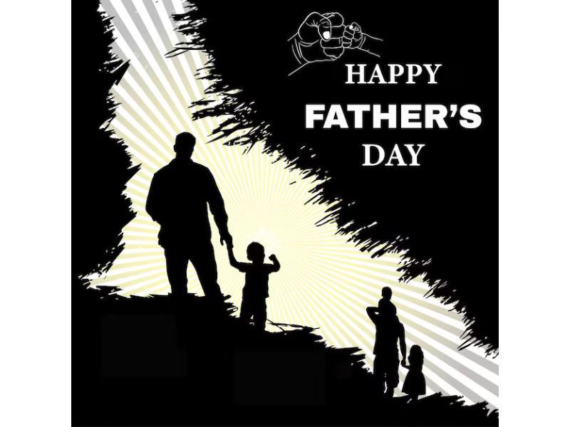
Black
Black is one of the most commonly used colors for Father’s Day products. It symbolizes strength, authority, and sophistication, qualities that many people associate with father figures. Black is also highly versatile in design; It can serve as a backdrop to make other colors pop or convey a sleek, formal aesthetic for your products.
When combined with red, black becomes even more powerful and striking, conveying authority, steadfastness, and the protective spirit that fathers often embody. For sellers, black works well across various POD items, from masculine t-shirts and mugs to classic posters, helping create designs that feel both strong and elegant.
White
In contrast to black, white represents purity, hope, and success. It brings a sense of peace and security and evokes respect. White also connects to childhood, innocence, and fond family memories, giving products an extra layer of warmth and meaning.
For POD sellers, white pairs beautifully with navy blue or red to create balanced designs that are both eye-catching and sophisticated. It is an ideal color for gifts that carry a meaningful, refined message, whether it’s a mug, t-shirt, or personalized poster.
Dark Red
Dark red evokes love, passion, energy, and courage. It also symbolizes power and confidence of fathers in the families.
Historically, red has been associated with royalty and formal occasions, making it particularly suitable for honoring fathers. Dark red is also an excellent choice for creating focal points in your POD designs, whether it’s for t-shirts, mugs, or other gift items. It adds emotional depth while maintaining a strong appeal.

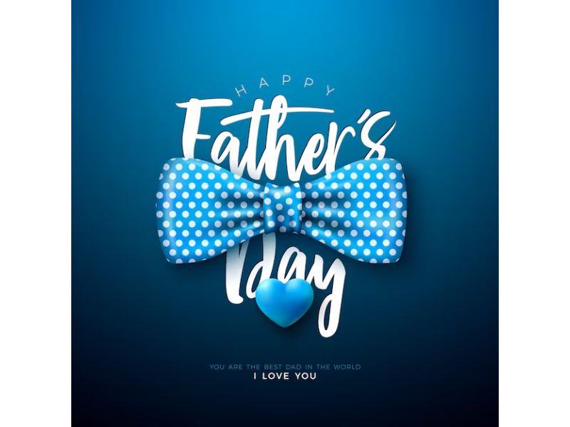
Dark Blue
Dark blue symbolizes knowledge, serenity, loyalty, and seriousness. Fathers are often the ones ready to share knowledge, guide, and protect their children, and blue perfectly reflects these qualities.
When combined with white, dark blue creates a sense of alertness, intelligence, and masculinity, while also producing a subtle balance in the design. This is a color favored by most men.

Navy Blue
Navy blue is often associated with reliability and strength, qualities characteristic of many fathers. It conveys a sense of stability, security, and trust, making the recipient feel protected and reassured.
This color is very versatile: it can be used as a background to highlight bright details or as the main color for t-shirts, mugs, or posters. When paired with neutral tones like white or gray, navy blue evokes sophistication, masculinity, and easy color coordination. It also represents maturity, confidence, and knowledge, helping products carry a meaningful message about the role of a father.
Olive Green
Olive green is an earthy tone that provides a sense of stability, balance, and closeness to nature. It symbolizes protection and care.
Olive green pairs easily with other colors without being too bold, creating a warm, approachable, and trustworthy feeling. This color is ideal for products aimed at conveying family love or nature-inspired designs, evoking stability and harmony in the father-child relationship.
Burgundy
Burgundy, a deep shade of red, gives a sense of depth, sophistication, and emotional richness. It represents strength while still carrying heart, reflecting a father’s care and guiding role within the family.
In POD designs, burgundy is often used to create accents or as the main color. And when combined with black or white, it conveys power, class, and masculinity while maintaining warmth and subtlety.
Warm Grey
Warm grey is a mature and stable color that helps balance more vibrant colors in a design. It represents calmness, rationality, and stability of fathers in families.
Warm grey is often used as a background or supporting color, allowing reds, blues, or yellows to stand out. It conveys sophistication, neutrality, and professionalism, making it suitable for men’s gifts like t-shirts, mugs, or modern posters.
Burnt Orange
Burnt orange evokes energy, enthusiasm, and warmth, symbolizing the joy and excitement fathers bring to their families. It is also a color that reflects liveliness and a spirited mindset, perfect for highlighting design elements.
Combine burnt orange with neutral tones or blues to create strong contrast, making products eye-catching and dynamic. This is an excellent choice for products targeting a younger audience or those seeking warmth and creativity.
Ivory
Ivory – a soft off-white shade – conveys purity, elegance, and gentleness. It serves as an ideal background for other colors to shine while maintaining a clean, sophisticated overall look.
Ivory is often used as a base for t-shirts, mugs, or posters, especially when aiming for a clean, elegant, and refined aesthetic. Pairing ivory with blue, red, or brown creates a harmonious balance, combining masculinity with high visual appeal.
Combining colors in Father’s Day designs
When designing products for Father’s Day, harmoniously combining colors helps create eye-catching designs while leaving a strong impression on customers. Here are some popular color combination suggestions:
- Black + Dark Red: Creates a sense of strength, power, and masculinity. This combination exudes sophistication and prominence, reflecting determination and the protective spirit that fathers embody. It is ideal for t-shirts, mugs, or posters with a classic style.
- White + Blue (or Navy Blue): Conveys elegance, refinement, and intelligence. This balanced combination creates a masculine feel while maintaining harmony in the design.
- Red + Blue: Evokes energy, passion, and warm emotions. Together, these two colors highlight design details while communicating joy and family affection.
- Olive Green + Warm Grey: Creates a sense of stability, balance, and closeness to nature. This combination is perfect for designs emphasizing family love or a nature-inspired style, providing a harmonious and grounded feel.
- Burgundy + Ivory: Represents luxury, sophistication, and warmth. This pairing is ideal for premium gift products, making them stand out while maintaining an elegant look and easily coordinating with other colors.
- Burnt Orange + Neutral Tones or Blue: Brings energy, enthusiasm, and vibrancy. This combination creates striking highlights, making products more attractive and suitable for youthful, creative designs.
How to choose the right colors for different product types
If you’re planning your POD products to sell on Father’s Day, understanding how colors work across various product types can help you create designs that look better and sell more effectively.
For Father’s Day T-Shirts
The ideal colors for Father’s Day t-shirts often depend on the father’s style. However, traditional shades like royal blue, black, and gray remain popular because they are easy to pair with various outfits and appeal to most tastes.
Additionally, bright colors such as orange, lime green, or yellow are also great choices, especially in spring and summer, making t-shirts stand out and feel more dynamic.

For Mugs
Black, white, dark blue, or burgundy are often preferred for mugs. These colors are masculine yet refined, making them easy to combine with text or personalized images.
Color-changing mugs are also an interesting option. When hot liquid is poured in, the mug reveals hidden messages or images, creating surprise and adding uniqueness to the gift.

For Posters & Wall Art
Posters or wall art work well with navy blue, dark blue, burgundy, and warm gray, as these colors convey sophistication, masculinity, and are easy to match with home décor.
Natural tones such as olive green, burnt orange, and ivory are also suitable for landscape art, abstract artwork, or decorative pieces inspired by nature.

Read: Wall Art Trends 2026: 8 Best-Selling Ideas for POD Sellers
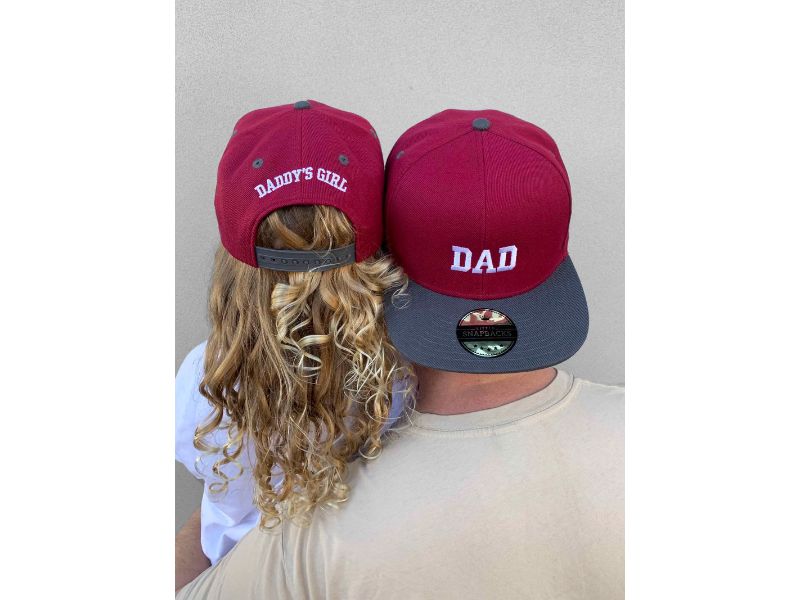
For Hats & Caps
Dark shades like black, navy blue, or olive green are often preferred for hats and caps because they are easy to pair with daily outfits and suit a variety of styles from classic to modern.
- Black: Masculine, versatile, conveys strength and sophistication.
- Navy Blue: Elegant and refined, still masculine, easy to pair with t-shirts or hoodies.
- Olive Green: Nature-inspired, ideal for dads who love outdoor activities or casual style.
Additionally, burnt orange or burgundy can create bold accents, perfect for those who enjoy a youthful and expressive style.
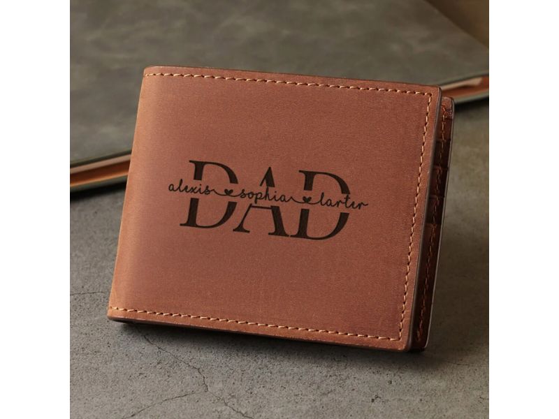
For Bags & Wallets
Dark brown, black, or olive green are commonly used for bags and wallets because they provide a classic, sophisticated, and durable look – qualities many people look for in gifts for fathers.
- Dark Brown: Evokes stability, maturity, and classic style.
- Black: Elegant, suitable for anyone, easy to pair with various outfits and styles.
- Olive Green: Brings a natural, youthful feel while remaining masculine.
These colors are not only visually appealing but also practical for long-term use, suitable for office bags, wallets, backpacks, or crossbody bags.
For Home Décor & Office Gifts
Ivory, warm gray, light green, or pastel blue are great for small yet elegant gifts, suitable for offices or living rooms.
- Ivory: Pure, elegant, helps decorative details stand out.
- Warm Gray: Neutral, calm, creates a professional feel and pairs easily with other colors.
- Light Green: Fresh, nature-inspired, and relaxing.
- Pastel Blue: Soft and gentle, evokes tranquility, perfect for a workspace or reading corner.
These colors are ideal for gifts such as small frames, desk calendars, vases, pen holders, or decorative figurines, combining aesthetic value with thoughtful attention to detail.
How to choose the right colors for different Fathers
For the Classic Man
For the traditional man in your life, a classic masculine color palette is a safe and sophisticated choice. Many spaces, clothing, or accessories with a “masculine” style often use shades of burgundy, dark brown, along with various reds, browns, blues, and grays.
Navy blue and red are commonly regarded as masculine colors, appearing in sports team logos, fashion, traditional American tattoo art, and many other areas. These are safe, neutral colors that are easy to use across a variety of gifts, such as sweaters, hats, socks, outerwear, and other accessories.
For the Outdoorsy Dad
If your father enjoys hiking, camping, or gardening, a nature-inspired color palette is a wonderful way to show thoughtfulness toward his hobbies.
Various shades of green, blue, dark brown, sand beige, and burnt orange are ideal choices. They work well for everything from t-shirts and outdoor gear to decorative accessories, even landscape paintings or nature-inspired sculptures. These colors directly connect with the recipient’s interests and personality while creating a personalized gift experience.
For Millennial Dads
Millennial fathers tend to be more relaxed in their color choices, unconstrained by traditional palettes. Research shows they focus more on spiritual qualities and personality traits rather than just physical strength or appearance.
For Millennial dads, you can experiment with warm metallics like copper, gold, and silver, or bright shades of purple, sunny yellow, neon, pastel green, and pastel blue. They also favor minimalistic styles that pair easily with neutral tones such as beige, gray, black, and brown.
This opens opportunities for creativity, combining masculine but modern colors that reflect personality while producing unique, eye-catching gift products.
For the More Feminine-Inclined Man
Some colors are often labeled as “feminine” but are not limited to women. If this is your dad’s favorite color, feel confident using it to express affection.
You don’t have to choose pink exclusively unless that is genuinely his preference. Softer masculine shades with a hint of femininity can express subtle personality: light blues and greens, soft gray, blush, or gentle tones like lavender or pale orange. These colors usually convey delicacy and sophistication while still maintaining a man’s masculine essence.
Choosing the right Father’s Day colors can make a significant difference in gift design. From classic masculine shades to natural tones, each palette can help products stand out while carrying meaningful messages. For POD sellers, understanding how to apply Father’s Day colors to different product types can help create designs that are both visually appealing and aligned with customer preferences.
Try applying these suggestions to create unique, emotionally resonant designs and get them ready to feature in your store today.


