
Contents
Have you ever designed something that looked perfect on your screen but printed completely differently? You’re not alone. The reason is simple: your screen and your printer speak two different color languages: RGB and CMYK. And unless you know how each system works, your colors can shift, dull out, or even disappear when moving from digital to print.
Understanding CMYK vs RGB isn’t just “technical knowledge” for designers — it’s the key to making sure your work turns out exactly the way you imagined. In this guide, we’ll break down the differences in the simplest way possible and show you when to use each one so you can avoid costly mistakes and get perfect results every time. Let’s dive in.
CMYK vs RGB: What are the differences?
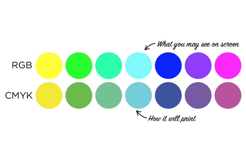
- CMYK is for printing and uses four ink colors (Cyan, Magenta, Yellow, and Key/Black). It works by subtracting light from white paper, which is why printed colors look softer and less vibrant than what you see on a screen.
- RGB is for screens and uses Red, Green, and Blue light. Because RGB is additive (colors are created by mixing light), it can display very bright, vivid, glowing colors that CMYK inks cannot reproduce.
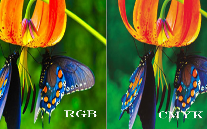
- Use CMYK for anything that will be physically printed (business cards, T-shirts, packaging) and use RGB for anything shown on a screen (websites, social media, digital ads). Sending RGB files to print will cause automatic conversion, often resulting in duller or shifted colors.
Important notes for printing design with Merchize
- Merchize recommends and expects sellers to design and submit files in CMYK for POD products. This is the standard used by all printers to achieve the closest match between design and printed product.
- Files designed in RGB may print with color deviations (pale, dull, or incorrect colors). If color issues happen because the artwork was in RGB, Merchize will not take responsibility.
- CMYK files should be saved as JPG. PNG files must be in RGB. If you must use transparent backgrounds for print on demand at Merchize, you must convert CMYK to RGB before exporting PNG.
- Merchize expects sellers to verify color mode before sending files converted using proper print profiles, especially Working CMYK – U.S. Web Coated (SWOP) v2.
What is CMYK?
CMYK is a color model used in printing that mixes four ink colors to create the full range of colors you see on printed products.
- C = Cyan (a bright blue-green)
- M = Magenta (a purplish-red)
- Y = Yellow
- K = Key/Black (black ink is used instead of mixing C+M+Y to make black because mixing those three inks creates a muddy brown and uses much more ink)
If you look at the ink cartridges in most home or office printers, you’ll see four separate ones labeled C, M, Y, K—that’s CMYK in real life.
When a printer produces green, it actually mixes cyan + yellow inks, just like how you would mix paints to get new colors.
Unlike RGB (which creates color by adding light), CMYK works by subtracting light from white paper using inks.
When to use CMYK
Generally speaking, CMYK color profile is required anytime your design is going onto a physical surface.
- Designing material that will be printed on paper: business cards, flyers, brochures, posters, menus
- Design product packaging: labels, boxes, stickers
- Design apparel prints, merch: T-shirts, tote bags, hoodies, promotional swag, labels
- Design large printed materials: banners, signage, billboards
- Design brand materials that can be printed: logos for print, letterheads, envelopes
Best file formats for CMYK
- PDF (especially PDF/X-1a or PDF/X-4) is the most recommended format. It’s universally accepted by all printers, perfectly preserves CMYK colors, fonts, transparency, vectors, and bleed settings.
- AI (Adobe Illustrator native file) is excellent when you need everything to stay fully editable. It keeps 100 % of your CMYK values and vector data intact.
- EPS remains a very reliable choice for CMYK and vector artwork. Although it’s an older format, it’s still widely supported by professional print shops and rarely causes problems.
- TIFF (300 DPI, flattened, saved in CMYK mode) is the go-to format for photographic or heavily raster-based designs. When saved correctly (no or LZW compression), it delivers perfect quality with no colour surprises.
- PNG can work in a pinch because it supports transparency, but it’s created in RGB by default, so colours almost always shift when converted to CMYK. Use only if the printer requires it.
- JPG/JPEG should be avoided for print. It’s always RGB, uses lossy compression that softens details, and doesn’t support transparency. Colours and sharpness might be lost.
- PSD (Photoshop files) are sometimes accepted, but printers strongly prefer flattened files. Layers, RGB elements, or Photoshop-specific effects often cause issues during processing.
- GIF is never suitable for print. It has limited colours and no real CMYK support, making it useless for professional printing.
What is RGB?
RGB stands for Red, Green, Blue.
It is an additive color model used for anything that emits light, for example, screens, monitors, phones, TVs, or laptops. They all use tiny red, green, and blue lights that blend to create colors.
If you zoom into a screen or look at it under a magnifying glass, you’ll see tiny red, green, and blue dots—those are the RGB pixels.
By turning these lights brighter or dimmer, the screen creates different colors.
When all three are off, you see black. When all three lights shine at full brightness, you see white. Mixing different brightness levels of red, green, and blue creates millions of colors.
This is why screens can display vibrant, glowing colors—because they’re made from light, not ink.
When to use RGB
Use RGB every time your design will only be viewed on a screen:
- Websites, apps, and online stores
- Social media graphics (Instagram, Facebook, TikTok, Twitter/X, YouTube thumbnails)
- Digital advertisements (Google Ads, Meta, LinkedIn)
- Presentations, ebooks, and PDFs shown on screen
- Email newsletters and banners
- Phone wallpapers, NFTs, digital illustrations
- Video, animation, and streaming
- Product mockups shown online
If you send RGB files for T-shirts, business cards, posters, packaging, or any print-on-demand service, the printer will convert them to CMYK, and your bright colors will become dull or shift.
Best file formats for RGB
- PNG is the number-one choice for almost all screen graphics. It supports full transparency, delivers lossless quality, and keeps logos, icons, illustrations, and text perfectly sharp at any size.
- JPG / JPEG is the best option for photographs and complex images when you need to keep file sizes small. It creates much smaller files than PNG while still looking excellent on the web and social media — always export at 80–100 % quality for the best balance.
- SVG is ideal for logos, icons, and any illustrations that must scale perfectly on websites, apps, or responsive designs. As a vector format, it stays razor-sharp at any resolution and usually results in the smallest possible file size.
- WebP is Google’s modern format that gives you smaller files than both JPG and PNG while maintaining equal or better quality. It also supports transparency and animation, making it an increasingly popular choice for fast-loading websites and online stores.
- GIF should only be used for simple animations or very basic graphics. It is limited to 256 colors, so photos and detailed artwork always look poor in this format.
- AVIF is the newest and most efficient format available today. It delivers even smaller files and higher quality than WebP, but browser and platform support is still growing, so use it only when you’re sure your audience can view it.
How to set up RGB and CMYK color profiles for your design file?
Before you start designing, it’s important to choose the correct color profile so your colors display and print exactly as expected. Here’s how to quickly set up RGB or CMYK in the most commonly used design tools.
How to set up the color profile in Photoshop
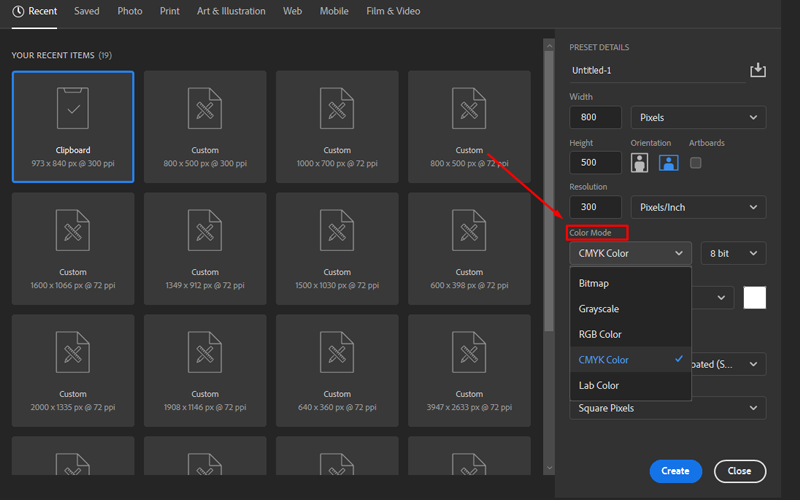
When creating a new file in Photoshop, you can select the color profile for your design:
- Create new file: File > New
- Set up color profile: In Color Mode > Select RGB Color or CMYK Color from the drop-down.
How to set up the color profile in Illustrator
Start setting up the right color profile when you first create the design file:
- Create new file: File > New
- In the New Document window, open Advanced Options (collapsible) and set Color Mode to RGB or CMYK.
How to set up the color profile in InDesign
In InDesign, you can follow these steps to set up the right color mode:
- Create a new document
- Choose Intent: Print (defaults to CMYK) or Web/Mobile (defaults to RGB). InDesign uses the document intent to set default color behavior.
How to check if your file is in RGB or CMYK
Before exporting or sending your artwork to print, it’s essential to confirm whether your file is set to RGB or CMYK to avoid unexpected color shifts. The steps below show you how to quickly check the color mode in Photoshop, Illustrator, and InDesign.
In Photoshop
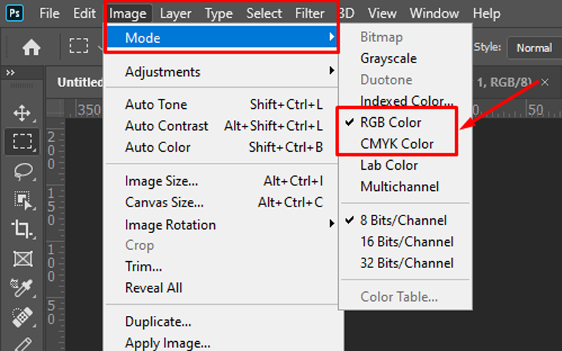
Method 1: Check via the Menu
- Open your PSD file in Photoshop.
- Go to the top menu and click Image.
- Select Mode.
- In the dropdown menu, you will see a list of color modes.
- The one with a checkmark ✓ next to it is the current mode.
- If RGB Color is checked → your file is in RGB.
- If CMYK Color is checked → your file is in CMYK.
Method 2: Check via Document Tab Info
Look at the document tab at the top of your workspace. You’ll often see something like:
- filename.psd @ 100% (RGB/8)
- filename.psd @ 100% (CMYK/8)
This also tells you the current color mode.
Method 3: Check via Document Info Panel
- Go to Window → Info.
- Click the small panel menu (top right of the Info panel).
- Choose Panel Options, then enable “Document Profile.” You’ll see the color mode displayed (RGB or CMYK).
In Illustrator
Method 1: Check Document Color Mode (Fastest)
- Open your Illustrator file.
- Go to File → Document Color Mode.
You will see two options:
- CMYK Color
- RGB Color
The option with the checkmark ✓ is the current color mode.
Method 2: Check From the Document Tab
Look at the top of your workspace on the document tab:
It often shows something like:
- filename.ai (CMYK)
- filename.ai (RGB)
This instantly tells you the mode.
Method 3: Check via Color Panel
- Open Window → Color.
- Look at the sliders:
- If the sliders show C, M, Y, K → your file is in CMYK mode.
- If the sliders show R, G, B → your file is in RGB mode.
InDesign
Unlike Photoshop or Illustrator, InDesign documents do NOT have a single “document color mode.” Instead:
- The workspace uses whatever color profile you set, and
- Each object/image inside the document may be RGB or CMYK.
So you don’t “check the file mode” — you check the color profile or the color values used in elements.
Method 1: Check Your Document Color Profile (Closest equivalent to RGB/CMYK mode)
- Go to Edit → Assign Profiles…
- Look at:
- RGB Profile
- CMYK Profile
This tells you what profiles your document is currently using for color management.
Method 2: Check the Color of Any Object
- Select an object (shape, text, etc.).
- Open Window → Color → Color.
- Look at the color sliders:
- If you see C, M, Y, K → the object is using CMYK colors.
- If you see R, G, B → the object is using RGB colors.
Method 3: Check image file color mode (placed images)
- Select the linked image.
- Open Window → Links.
- Click the image → see details in the Links panel flyout menu → Link Information.
- You will see:
- Color Space: RGB
- Color Space: CMYK
Method 4: Preflight Panel (to find RGB before printing)
- Go to Window → Output → Preflight.
- Use the Print Profile.
- InDesign will flag RGB images if your document is meant for CMYK printing.
How to convert between RGB and CMYK?
Sometimes you’ll need to switch your artwork between RGB and CMYK to match your final output or printer requirements. Here’s how to quickly and safely convert your file in Photoshop without losing color quality.
In Photoshop
Method 1:
- Open your file in Photoshop.
- Go to Image → Mode.
- Choose CMYK Color or RGB Color.
- Photoshop will convert all colors in the document.
Method 2:
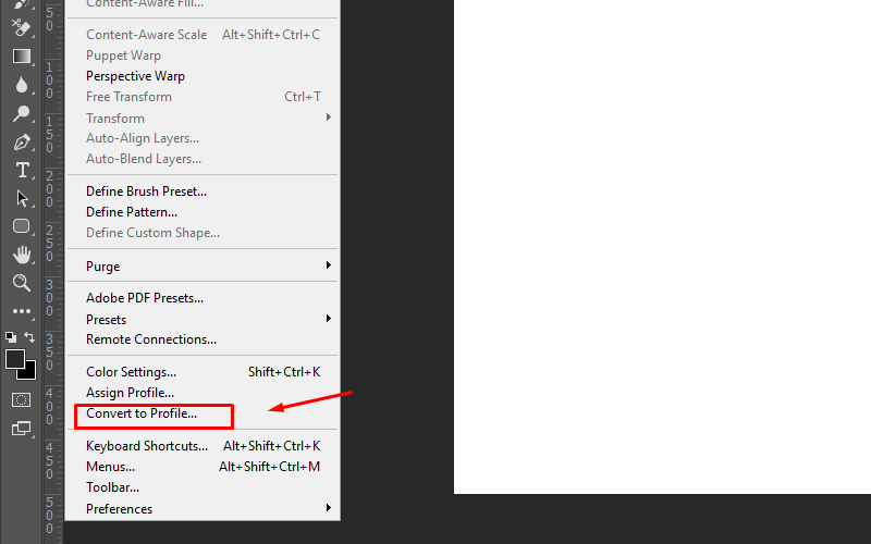
- Open your file in Photoshop.
- Go to Edit > Convert to Profile
- In the new dialog box, click the drop-down in the Destination Space field. Select your desired color mode.
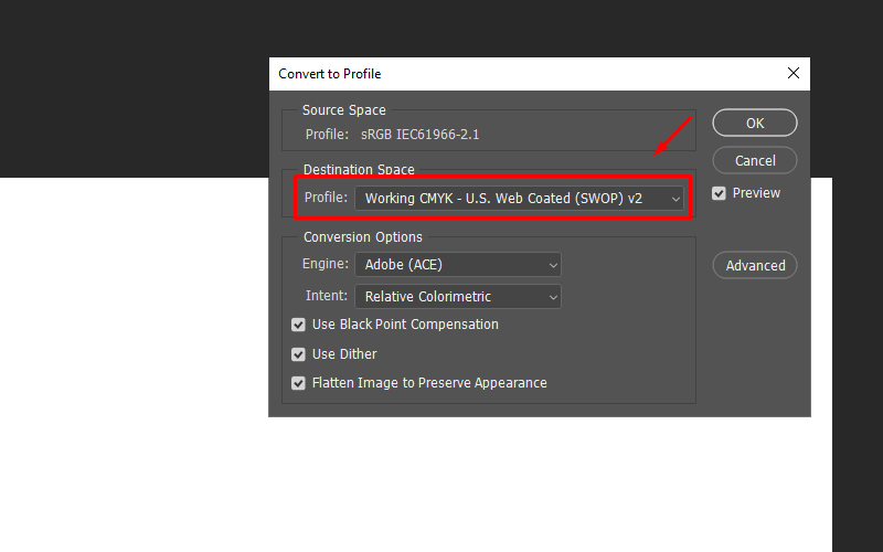
Note: There are different options for the RGB or CMYK colors. For most projects, the first one or two options work well. However, if you’re sending your design to a professional printer, it’s best to ask which profile they prefer.
⚠️ Tip: If your file has multiple layers, select Flatten Image to Preserve Appearance. This helps keep your colors looking consistent, especially if you’ve used blending modes or transparency.
In Illustrator
Method 1:
- Open your AI file.
- Go to File → Document Color Mode.
- Select either:
- CMYK Color
- RGB Color
Your artwork will convert instantly.
Method 2:
- Open your AI file
- Select all objects in your documents
- Go to Edit > Edit Colors
- Select your desired color mode.
InDesign
⚠️ Important: InDesign does not convert the whole document at once.
Instead:
- Color swatches can be RGB or CMYK
- Placed images keep their original mode
- Conversion usually happens during export
Here are the correct methods to convert color swatches
- Go to Window → Color → Swatches.
- Double-click a swatch.
- In Color Mode, choose:
- CMYK
- RGB
Convert placed images (recommended for print)
- Before placing images, convert them in Photoshop → save as CMYK TIFF/PSD/JPEG.
- After placing:
- Select the image.
- In Links Panel, check its color space.
- If it’s RGB, open it in Photoshop and convert.
How to get the best print results with CMYK?
To achieve vibrant, accurate, and professional-looking prints, it’s important to follow a few proven best practices when working in CMYK. The tips below will help you minimize color shifts and ensure your final product looks as close as possible to your design.
Start design in CMYK mode
Whenever you design for printing, always start in CMYK. The colors you see on your screen are already closer to what the printer can create.
If you design in RGB first, the colors may look bright on screen but become dull when converted to CMYK. Starting in CMYK keeps everything consistent from the start.
Use the Right CMYK Color Profile
Every printer and print shop uses slightly different standards. A CMYK profile tells your computer how to “translate” colors for that specific printer.
If you pick the wrong profile, the final print may shift. Using the correct profile helps your colors print the way you expect.
Avoid Extremely Bright or Neon Colors
Some colors you see on your screen simply cannot be printed. Neon or very bright RGB colors don’t exist in CMYK ink.
If you use them, your print may look muted or darker. Adjusting your colors early helps ensure your final print looks intentional, not faded.
Calibrate Your Monitor
Your screen may be too bright, too warm, or too cool. A calibrated monitor shows more accurate color, closer to real-life print results.
This means what you see while designing is more trustworthy, helping you avoid unexpected color changes once printed.
Use High-Resolution Images (300 DPI)
High-resolution images print clearly and sharply. Low-resolution images may look fine on your screen but will appear blurry or pixelated on paper.
Using 300 DPI ensures your prints look professional, detailed, and clean.
Flatten Transparency and Expand Effects
Effects like shadows, glows, gradients, and blending modes sometimes behave differently in print. They may print with harsh edges or unexpected colors.
Flattening or expanding these effects turns them into simple shapes or images, helping the printer reproduce them exactly as you see on screen.
Test With a Small Print Sample
A test print (or proof) lets you check colors, sharpness, and layout before printing large quantities.
It’s a simple way to catch mistakes early and adjust your design if something doesn’t look right in real life.
FAQs about working in different color systems
Can RGB images be printed?
Yes, RGB images can be printed, but the results may not look the same as what you see on your screen. When you send an RGB image to print, the printer or printing software will automatically convert it to CMYK. This automatic conversion often makes the colors look duller or slightly different because CMYK inks have a smaller color range.
Should I convert my RGB image to CMYK for printing?
Yes, you should convert your RGB image to CMYK before printing. By converting to CMYK ahead of time, you can see the real, printable colors and adjust them as needed. This gives you more control over the final result and reduces the chance of unexpected color shifts when the design is printed.
Why does the K stand for black in CMYK?
In CMYK, the K stands for “Key”. This word refers to the key plate used in traditional printing. The key plate is used to add the detail, contrast, and outlines of an image, and this plate has always been printed in black ink. So letter K was chosen to represent the color black instead of B.
“K” is used to avoid confusion with Blue in RGB and keep printing terminology clear and consistent.
So while letter K represents black, it also means that black is the key color that adds depth and definition in a print.
Conclusion
Understanding when to use CMYK and when to use RGB is one of the simplest ways to avoid color mistakes and get the results you want, whether you’re printing a T-shirt or designing graphics for the web. By choosing the right color system from the start, you’ll save time, prevent surprises, and create work that looks exactly the way you imagined.
Now that you know how each color model works, take a moment to set up your files correctly before you begin your next project. Start applying these tips today and elevate the quality of every design you create.


