
Contents
- Understanding popular printing terms
- What is the standard logo size on a T-shirt?
- Front design and logo placement on shirt
- Back design and logo placement on shirt
- Sleeve design and logo placement on shirt
- Seam-to-seam design and logo placement on shirt
- Tips for Measuring, Aligning & Centering Logos
- Popular combinations for design and logo placement
- In closing
Whether you’re starting your T-shirt venture or expanding your catalog, mastering the art of design and logo placement on custom apparel can take your business to the next level. In this article, we will introduce you to the most effective print locations for logos and designs and the exact measurements for each location, as well as sharing some helpful tips to create a T-shirt that wins.
This article will focus on T-shirts, but many of the standards can be applied to other apparel, such as hoodies, crop tops, polo shirts, and long sleeves.
Let’s do this!
Understanding popular printing terms
Before we start, here are some common printing terms used in this article to help you communicate effectively and understand the process:
- Print location: This term refers to where the print will be placed on the garment. The print area and placement can vary within the print location, and it can slightly indicate the size and position of the print.
- Print placement: This is the precise spot where the print will be placed. However, this spot may be adjusted by a few inches due to the size of the garment, preference, and other factors.
- Print area: This is the area of the fabric that will be covered by the ink. It’s important to consider the print area when placing a print on a garment with pockets, seams, buttons, etc
- Print size: The exact measurement of the artwork to be printed. The print size, along with the print placement, will determine the print area. We highly recommend you to determine the exact print size before placing an order.
- Standard size: Each print location has a standard size that is applied when customers do not request a particular size. The standard size may vary a little bit based on the design and garments.
- Oversize: Oversized prints are anything bigger than the standard size. Oversized prints are not a common request, but they fall somewhere between standard and maximum size.
- Maximum size: The maximum size is also considered oversize, and it is the largest size that can be printed for a particular order. This size can also vary depending on the item and print method, but it is easy to request.
- Anchor point: The anchor point is especially useful for centering designs that are not naturally symmetrical. For example, if you were printing a design of a person on a t-shirt, the anchor point would be the center of the person’s body, not the midpoint of the design. This would ensure that the person’s head is centered on the t-shirt, even if the person is standing in a pose that is not perfectly symmetrical.
Now, let’s take a closer look at the most popular design and logo placement and the standard size for each.
What is the standard logo size on a T-shirt?
A standard logo size is a widely accepted size that looks right on most t-shirts, without custom adjustment. If you are new to t-shirt printing, it’s safe to start with a standard logo size because it can offer:
- A safe default used by most print shops
- Visual balance without overwhelming the shirt
- Compatibility with common printing methods like screen printing, DTF, and embroidery
- Scalability and easy adjustment without affecting the layout
Below are the most commonly used standard logo sizes in inches for T-shirts:
- Left chest logo: 3”–4” wide – Best for brand logos, uniforms, and minimalist designs.
- Center chest logo: 8”–10” wide – Ideal for medium-sized logos, text designs, or simple graphics.
- Full front design: 10”–12” wide – Common for graphic tees and statement designs.
- Full back design: 10”–14” wide – Works well for large artwork, slogans, or sponsor logos.
- Sleeve logo: 2”–3.5” wide – Perfect for subtle branding or secondary logos.
Apart from logo placement, there will be specific requirements and factors to consider for the logo size that you should print. For example, oversized or streetwear t-shirts are more suitable for larger logos. On the other hand, logos on small t-shirts (baby tees, kid or youth t-shirts) might be significantly smaller than logos on big-size t-shirts. In these cases, standard sizes serve as a reference point, not a hard rule.
Front design and logo placement on shirt
Front placement is probably the most common print location and is more likely to catch the audience’s attention. We’ll explain in more detail about each placement below and bonus a handy cheat sheet!
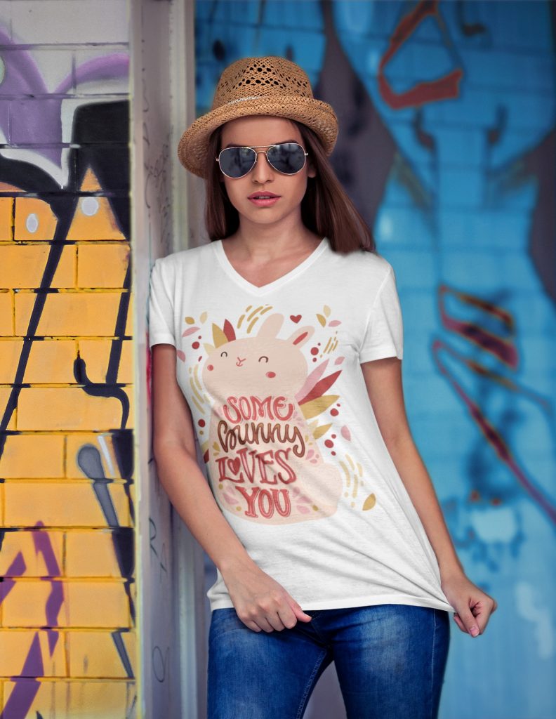
Center chest placement
The center chest placement is a popular and timeless option, and it’s almost always visible. We highly recommend using medium-sized designs, such as logos, words, or simple artwork for this location.
The standard size for center chest placement would be 6’’ – 10’’ wide and 6’’ – 8’’ tall. Make sure that your design isn’t too high, too low, or uncentered on your shirt. The design should be around 2.5’’ – 3’’ below the collar, and sit between the left and right seams.
Note: Center chest placement may not be ideal if your design is extremely wide, highly detailed, or vertically long. It’s also not the best choice for corporate branding or uniforms, where a more subtle and professional look is preferred.
![]()
Left chest placement
Left chest is the go-to placement for company logos or group uniforms. This area aligns closely with the heart and naturally falls within the viewer’s line of sight during face-to-face interaction. Over time, this placement has become a widely recognized standard for professionalism, especially in business, corporate, and uniform apparel.
With this purpose, your design will need to be neat and clear, and avoid putting too much detail because the audience will not have enough time to figure it out. The size for left chest placement is typically around 2.5’’ – 5’’ wide, 2.5’’ – 5’’ high, and around 3’’ down from the collar. However, you can always adjust the placement to harmonize with the overall of the shirt.
![]()
Full front placement
For this placement, we suggest applying 10’’ – 12’’ wide and 10’’ – 14’’ tall designs, and around 3’’ down from the neckline.
![]()
Full front designs can be detailed, complex, and bold; however, always make sure that you use high-quality files to avoid blurriness in the final print. Moreover, full front designs can take up the majority of the print area on the front of your shirt, and if you use screen printing, you can end up with a “sweat patch” on your T-shirt, which isn’t breathable and comfortable for the wearer.
Full front placement is best suited for graphic T-shirts, artistic designs, slogans, and bold statements.
Note: Full front designs may appear perfectly sized on a medium shirt, but look disproportionately small on XL or larger sizes. Consider scaling your artwork slightly for larger garments or choosing designs with strong visual weight that don’t rely solely on size for impact.
Oversize front placement
As the name suggests, oversize front print is anything bigger than the standard-sized full-front. These placements are perfect for a bold and fashion-forward look. An oversized front printing ranges from 12’’ – 15’’ wide and 14’’ – 16’’ tall, however, in some cases, you can’t go up to 14’’ wide due to the garment size, such as kids size, smaller ladies’s size, tank tops, etc. Oversize front placement typically starts higher than a center chest or full front placement, about 2’’ – 3’’ down from the collar.
Though certain designs work well in oversize, you still need to consider the surface area where the ink will cover when printing this size. As we’ve explained above, creating a “heavy print” without breathability wouldn’t be a great idea to wear all day long, and this can affect the customer experience. For oversize front placement, we suggest you to reduce the ink coverage as much as possible to make the shirt lighter, more flexible, and comfortable for the wearer.
Back design and logo placement on shirt
The back of a t-shirt is the second-most-popular print location after the front. Here are few things you need to know if you’re going for this placement:
Upper back placement
Upper back placement is a popular choice for uniforms and usually calls for medium-sized designs, similar to the center chest placement.
Upper back placement is widely used for staff shirts, security teams, volunteers, and event crews because it remains visible even when the wearer is moving or facing away. This placement makes it easy to identify roles in crowded environments while keeping the front of the shirt clean and uncluttered.
The standard size is 10’’ – 14’’ wide and 1’’ – 6’’ tall for the audience to read it from a distance. Make sure that the design is around 4’’ down from the collar.
If you are placing your design on the upper back of a t-shirt, use wide and short designs to maximize the space. If your design is at the maximum width and still looks too small, try using a taller font instead of stretching the font, which will distort it and make it harder to read.
Full back placement
The full back is a great choice for large or complex designs or even logo placement. If you’re making T-shirts for an event with multiple sponsors, you can represent their sponsorship levels by tiers. The logos at the top of the shirt would be larger and more noticeable, representing the highest-tier sponsors, with the logos below them getting smaller and smaller.
![]()
Full back designs are quite similar to the full front, but you can go up 10’’ – 14’’ wide and 6’’ – 15’’ tall. For full back design, we recommend you to combine with a design on the front, or sleeve, or both to enhance the whole look.
Note: Full back designs work best when paired with a small front element, such as a left chest logo or center chest text. This combination balances visual weight across the garment and ensures branding is visible from both front and back without overwhelming the design.
Sleeve design and logo placement on shirt
Sleeve placement is a stylish and distinctive way to showcase your brand elements like logos, patterns, graphics, or even taglines. A design on the sleeve can add visual interest to your T-shirt and make it stand out from popular front or back placements.
However, the sleeve area is smaller than the front or back of the shirt, so you need to carefully consider the size, readability, and proportionality of your design. That’s why we recommend small prints for this area. The standard size is around 3’’ wide x 1.5’’ height, but you can go up to 4.5’’ wide (not recommended unless your logo is very wide), or as small as 1’’ wide.
![]() Here are some additional tips for an effective sleeve logo placement:
Here are some additional tips for an effective sleeve logo placement:
- Choose a simple logo design that will be easy to read and understand, even at a smaller size.
- Avoid using too much text in your logo.
- Use high-contrast colors to make your logo stand out.
- Consider placing your logo on the left or right sleeve, depending on where you want the focus of your design to be.
- Experiment with different sleeve placements to find the one that looks best with your design.
Seam-to-seam design and logo placement on shirt
At Merchize, we offer seam-to-seam design placement, which is also known as all-over print (AOP) to help sellers bring their endless creativity to life. AOP products allow sellers to design the entire front, back, and sleeves of a T-shirt, giving you full control over your design and creating an extraordinary product with unique patterns. Moreover, AOP is the solution for seam-to-seam placement as the ink blends into the fabric’s fiber, keeping the material breathable and soft to the touch even after printing.
![]()
You can also check out our blog post to find out the right T-shirt fabric to elevate your customer experience.
Though there’s no standard limit for the design size in seam-to-seam placement, it’s important to keep your design fits the safe area of the mock-up to avoid any cut-offs. You just need to make sure that the patterns won’t touch the collar or cross the seam. And don’t forget to take a last look at your design before sending it out for production – to make sure that everything is in place.
Tips for Measuring, Aligning & Centering Logos
Even a perfectly sized logo can look “off” if it isn’t aligned correctly. Proper spacing and centering are key to achieving a professional, balanced result.
How to measure from the collar correctly
Always measure from the collar seam, not the edge of the neckline fabric. Lay the shirt flat on a hard surface, smooth out any wrinkles, and measure straight down to the top of the design. This ensures consistent placement across different shirt styles and sizes.
How to center asymmetrical designs
For designs that aren’t perfectly symmetrical, visual centering is more important than mathematical centering. Instead of aligning by the design’s width, center it based on how it appears to the eye. This prevents designs from looking unintentionally shifted to one side.
Using anchor points in real layouts
Anchor points help you align designs more naturally. For example, if your artwork features a character or icon, use the main focal point (such as the face or central element) as the anchor—not the outer edges of the design. This technique keeps the design visually centered even when its shape is uneven.
Don’t print logo too high
Designs placed too close to the collar often feel cramped and uncomfortable to look at. They can also interfere with necklines and tags, making the shirt appear poorly balanced.
Adjust logo size for larger sizes
Using one fixed logo size across all shirt sizes can cause designs to look undersized on larger garments. Always preview how your logo appears on XL, 2XL, and 3XL shirts and adjust scaling when needed.
Don’t ignore seams, pockets, and collars
Placing designs too close to seams, pockets, or collars can lead to distortion or partially hidden artwork. Always account for garment construction when choosing placement and print area.
Avoid stretch distortion on wide designs
Wide designs printed across areas that stretch—such as the chest—can distort when worn. To prevent this, avoid overly wide graphics or use designs that can visually tolerate slight stretching.
In case you’re having trouble remembering all these measurements, we’ve got this handy cheat sheet for you!
| Logo Placement on T-shirt | Width (inches) | Height (inches) | Space from collar
(inches) |
| Center Chest Placement | 6’’ – 10’’ | 6’’ – 8’’ | 2.5’’ – 3’’ |
| Left Chest Placement | 2.5’’ – 5’’ | 2.5’’ – 5’’ | 3’’ |
| Full Front Placement | 10’’ – 12’’ | 10’’ – 14’’ | 3" |
| Oversize front placement | 12’’ – 15’’ | 14’’ – 16’’ | 2" – 3" |
| Full back placement | 10’’ – 14’’ | 6’’ – 15’’ | 3" – 4" |
| Upper back placement | 10’’ – 14’’ | 1’’ – 6’’ | 4" |
| Sleeve placement | 3’’ | 1.5’’ | – |
| Seam-to-seam placement | – | – | – |
Popular combinations for design and logo placement
If you’re looking for a way to elevate your T-shirt design and convey your message better, we’ve got some suggestions for you:
- Sleeve designs with small logos or design can go with front and chest placement
- Full back design are frequently paired with left chest or center chest placement
- Combine left chest designs and logos with upper back or full back designs to enhance the visual appearance.
These suggestions are based on our experience, however, you can always go beyond the limit and have fun exploring different combinations!
In closing
After all, creativity is about thinking outside the box. The suggestions in this article are simply as it is: suggestions. The best design and logo placement for your custom apparel will depend on the specific concept and the overall look you’re aiming for.


