Contents
As a pint on demand (POD) seller, you may wonder why some t-shirt colors fly off the shelves while others sit untouched. Why is that? What makes some colors so popular while others don’t perform as well? And how can your color choice affect your overall revenue?
In this article, we’ll answer these questions and list trending t-shirt colors in 2026. Whether you’re a new or experienced merchant, these insights can help you adjust your t-shirt color collection to boost your sales effectively this season.
Let’s dive into the details now!
What are The Most Popular T-shirt Colors?
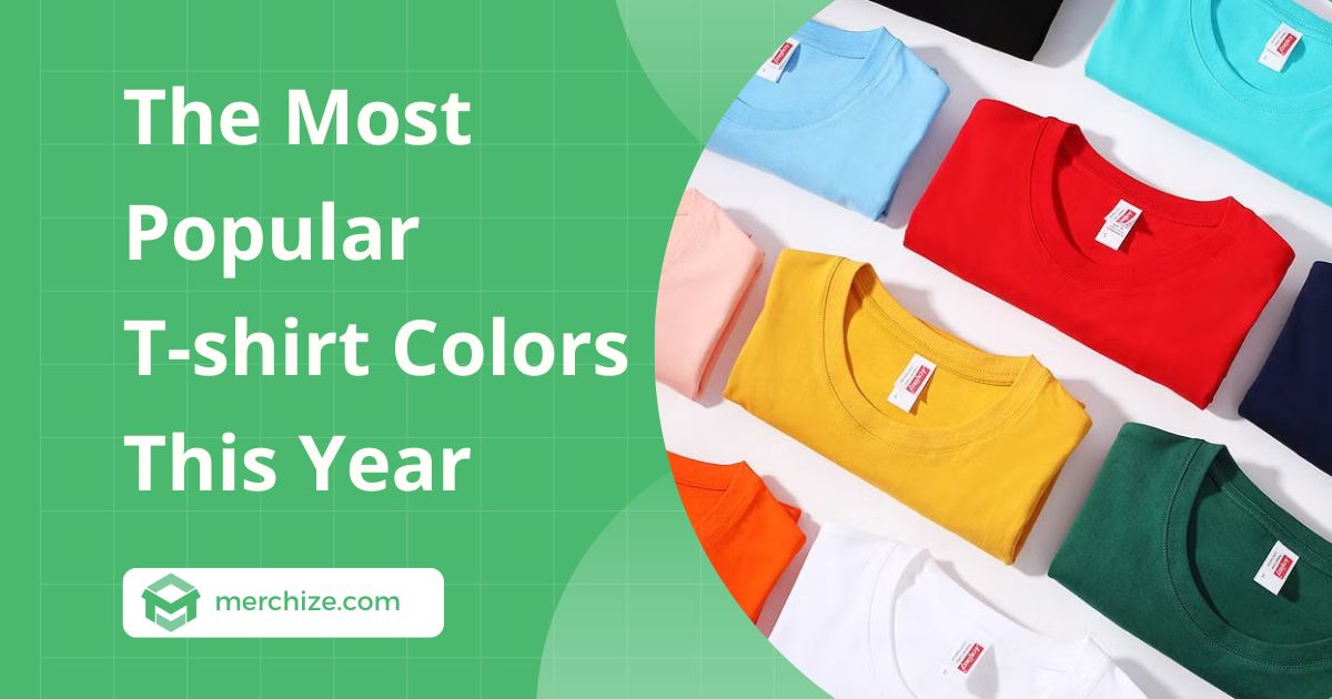
What colors come to mind when you think of popular t-shirt colors? Are they black, white, navy blue, red, and gray? If so, this is the exact answer to this question. According to our statistics, some best-selling t-shirt colors are still neutral. These colors help the design stand out, vibrant, and shine. They suit almost everyone of every age from men, and women to children, and never go out of style.
What are The Least Popular T-shirt Colors?
In the universe of t-shirt colors, neon green and mustard yellow are not usually popular. Because they are quite picky, difficult to mix with other colors, and often not suitable for everyday wear. For print on demand t-shirts, their brightness overshadows many designs, so sellers often have to design specifically for these colors.
However, neon can be suitable for some niches, sports events such as marathons, or even festivals. Additionally, POD sellers can consider choosing neon colors to serve a specific audience that likes bold, eye-catching looks or children’s clothing.
Classic Popular T-shirt Colors
The fashion color palette is always changing, but some colors are always timeless because of their convenience. You can add them as default colors for your custom t-shirt designs. Besides, research and grasp the market trends to update the hot trend colors at each time of the year.
1. Black
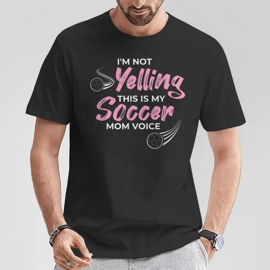
The first on this list is black. Black clothing has long been an indispensable staple in everyone’s wardrobe. Everyone will have a few items of this color such as dresses, pants, or t-shirts to wear in multiple situations. Customers love black T-shirts because they don’t show stains and have a slimming effect.
In addition, this color is durable, easy to coordinate, and flatters the skin, making it a suitable choice for everyone. Besides, black can highlight designs or printed logos that are easy to see and suitable for both simple and complex designs.
2. White
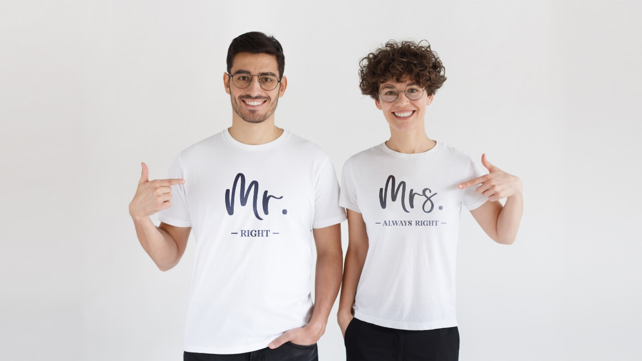
White is another versatile and popular shirt color. It’s clean and works well for layering and pairing with bolder colors. In 2026, white continues to be a popular choice, especially with minimalist or trendy designs.
Additionally, white t-shirts are perfect for designs that feature vivid colors, ensuring the artwork is striking against the neutral background. They’re also easy to customize for a variety of occasions, from casual streetwear to personalized gifts.
3. Black Heather
Black and black heather may look quite similar, but they are actually quite different. They differ in their shade and fabric composition.
Unlike solid black, black heather is a grayish black, created by blending black or white fibers. It gives a softer, more casual look than black. In print on demand, this color is popular and an alternative choice to black because of its ability to make any design stand out. It’s perfect for people who want to find a classic t-shirt color with a bit of a twist.
4. Gray Heather
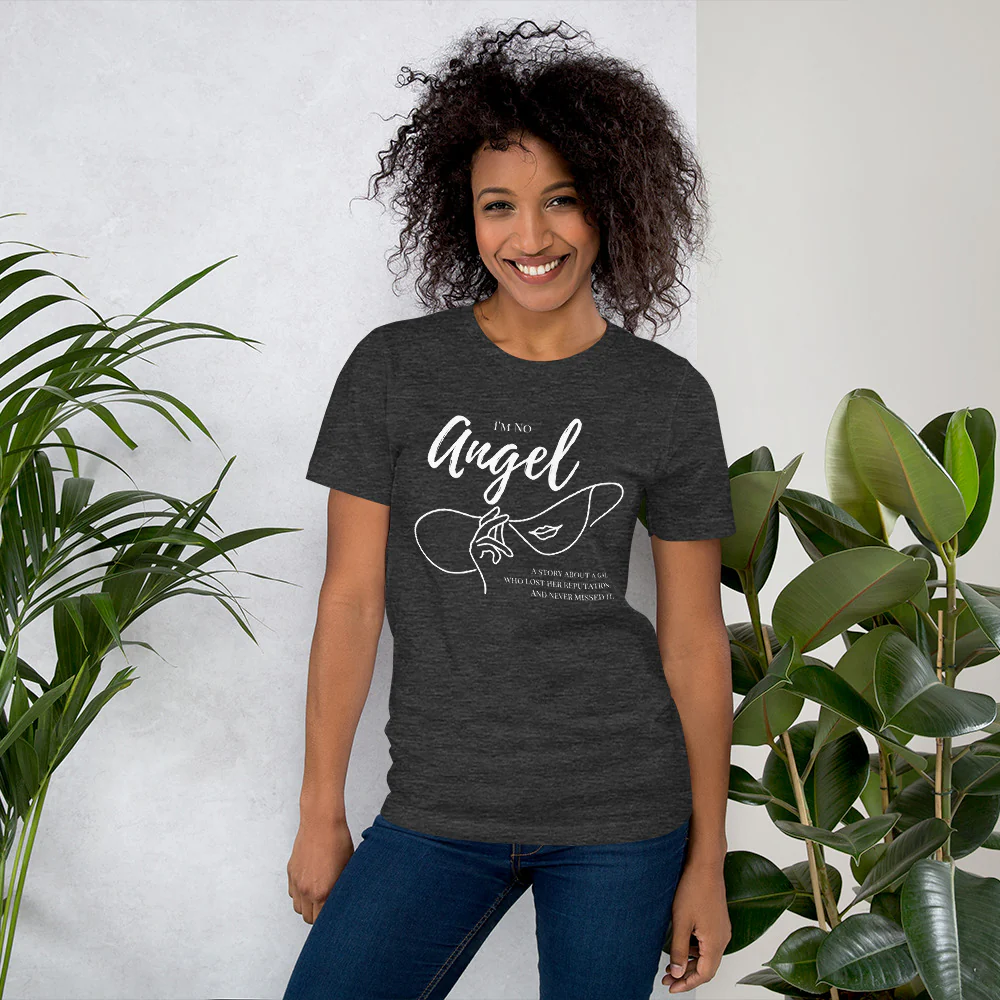
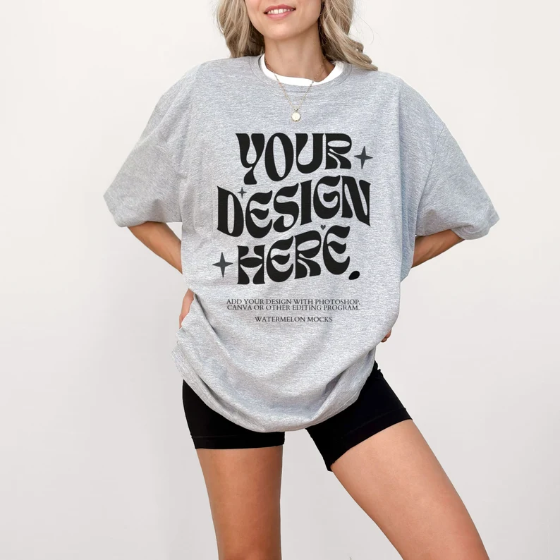
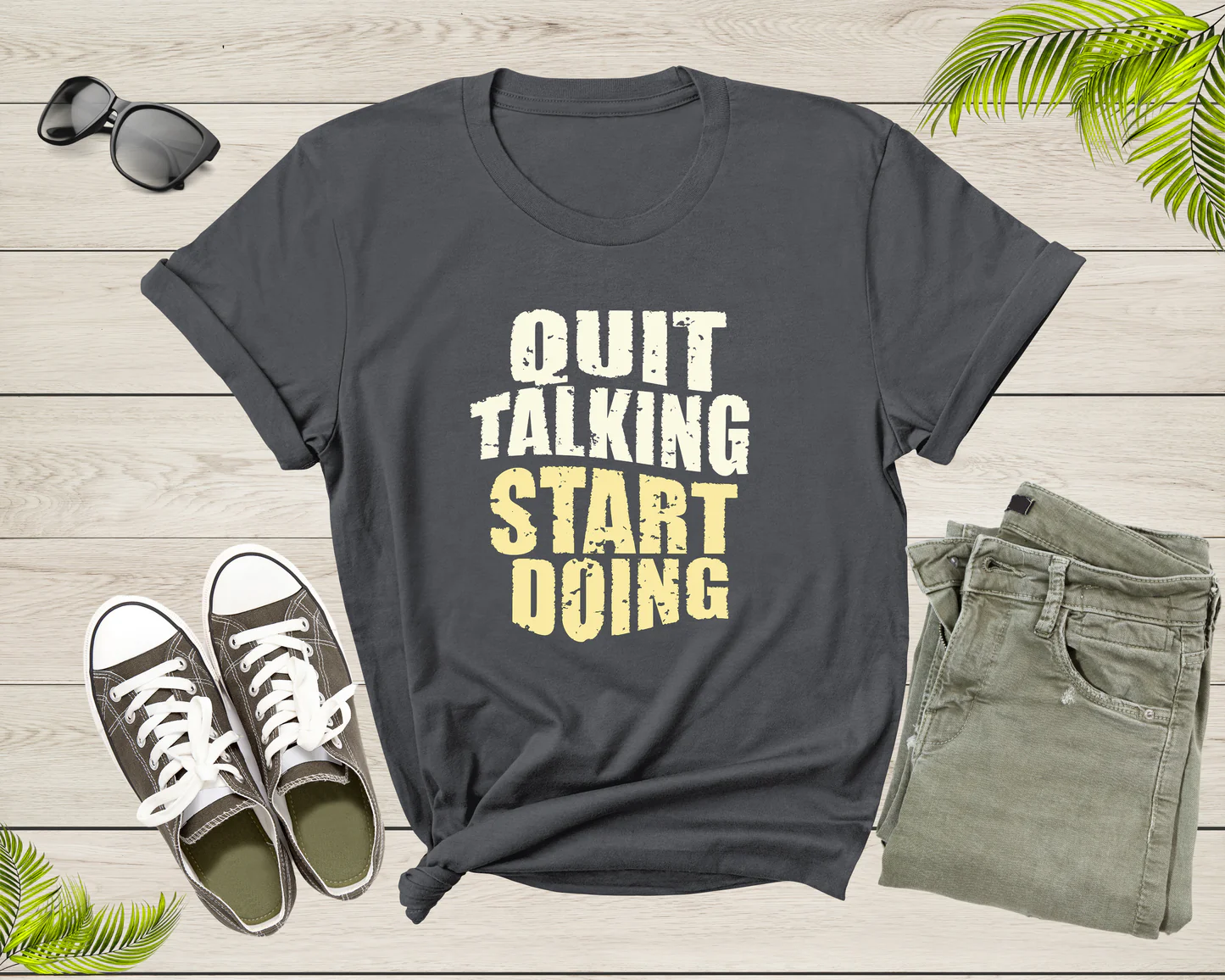
It’s easy to see why dark gray heather is a great choice for t-shirt printing. This subtle shade of gray can accentuate any design you put on it. With its neutral yet striking look, dark gray roles as the perfect backdrop and highlights the details you want your customers to notice.
Dark gray is not only aesthetically pleasing but also incredibly practical. It’s easy to match, looks great in any situation, and won’t stain or blemish easily, keeping your t-shirts looking fresher and lasting longer.
Trend T-shirt Colors in 2026
In addition to classic colors, you need to update a list of trending t-shirt colors this year to meet all customers’ needs. Every year, every season some colors gain consumer favor, and what are those colors, let’s see the list below.
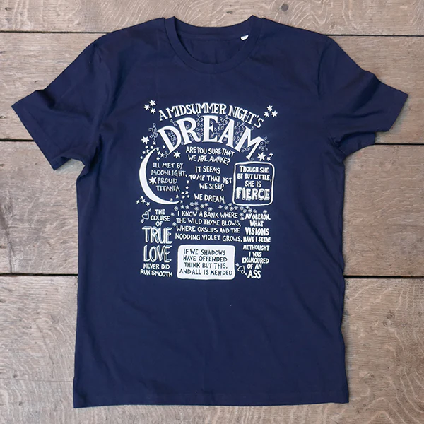
1. Navy Blue
Some customers tell us that they often have navy blue in their minds when choosing a color for their t-shirts. This is a classic color that mixes well with many other colors. It’s timeless, versatile, and easy to wear. Whether your style is trendy or professional, navy blue is the right choice. Consumers love this particular color because it looks flattering on various skin tones.
Pro tips: If you want to sell this color, consider pairing it with white ink for the perfect combination that will suit everyone. On the other side, some colors like black, gray, and light blue can go well with navy blue.
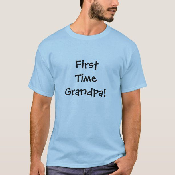
2. Light Blue
Light blue is a perfect choice for spring and summer t-shirts, bringing a soft and gentle feeling. Although a classic color, light blue still exudes freshness and youthfulness, easily highlighting the designs you want to showcase. Unlike dark blues look strong and fierce, light blue creates a light, relaxed, and ideal for use as a backdrop for many different designs.
Pro tips: a light blue t-shirt combined with navy blue ink brings harmony and gentle beauty. Alternatively, some colors like gray, white, and black are also great options, helping your designs stand out while maintaining elegance and comfort.
3. Royal Blue
Royal blue is a bold shade, associated with elegance and confidence. Although it is rarely used in everyday wear, it is a great choice for those who want to make an eye-catching statement. With its origins in British royalty, this color is not only luxurious but also extremely versatile.
Pro tips: Pair a royal blue t-shirt with white ink for a striking design, or mix it with black, beige, and gold for a unique touch. Whether you want to stand out or go elegant, royal blue is sure to enhance any design.
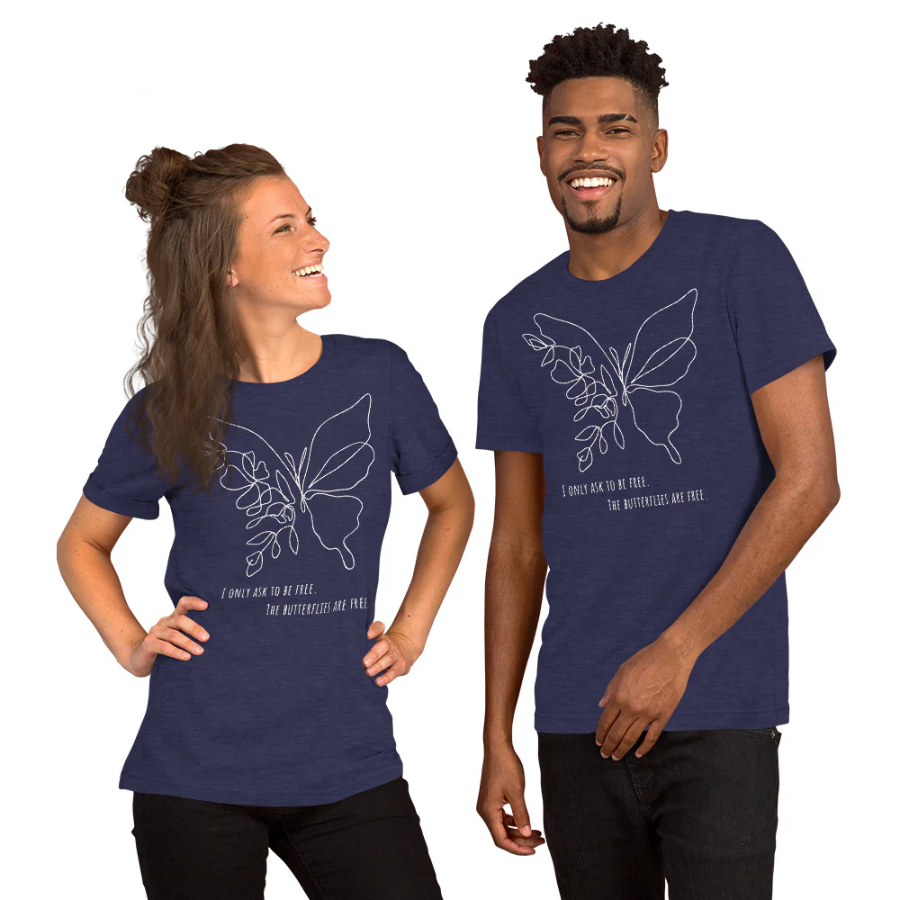
4. Heather Midnight Navy
Heather Midnight Navy combines a deep navy shade with a subtle blend of colors for a visually appealing effect. This is a great and versatile choice for custom-printed t-shirts due to its uniqueness.
For a striking print result, try combining it with white, yellow, or light blue ink. White ink will highlight the contrast, creating a sharp and overwhelming design. Yellow will add warmth and brighten the overall look, while light blue creates a soft and harmonious look.
Pro tips: if you want to add a more subtle accent, try adding a touch of silver or gray ink to add depth to your design.
5. Soft Cream
Unsurprisingly, soft cream is at the height of its popularity for t-shirts. This color offers a sophisticated, elegant look with timeless appeal. It appeals to minimalists, outdoorsy types, and bright outfits. Moreover, soft cream is suitable to wear every season and creates the perfect backdrop with a fun twist to help bold designs stand out.
Pro tips: Combine with black or navy ink for a dramatic contrast, or opt for light brown, ash gray, or olive green ink for a subtle and harmonious look.
6. White Heather Dust
White dust heather is a soft blend of white and a little bit of dusty gray, creating a soft neutral tone. With a clean and sophisticated look, this color brings a modern and pleasant feel. It is not as plain as pure white, but has the added depth of gray, helping designs stand out while still maintaining a minimalist look.
Furthermore, white dust heather works well with a variety of designs, from large, sharp images to small, delicate logos. The softness of this color also makes it suitable for relaxed or luxurious styles without being too over the top.
Pro tips: you can use black or navy ink for a clear contrast. Dark gray or silver ink will create an elegant look, while pastel tones like rose or mint green will add a soft, fresh, and comfortable feel.
7. Gray Athletic Heather
Gray Athletic Heather is a classic light gray shade with a distinctive blended look, often seen in sports apparel. It is dynamic and easy to coordinate, highlighting printed designs while maintaining a minimalist, modern feel. This color is a favorite for custom-printed t-shirts because it works with a variety of styles, from sporty to casual.
Pro tips: Black, navy, or red inks create a striking contrast, ideal for logos or sports designs. For a more subdued look, you can use white or dark gray inks to maintain harmony or try bright yellow for a bold, energetic.
8. Asphalt
Asphalt is like the brother of a black t-shirt that is modern, and stain-resistant, but more unique than regular black. With its sleek and luxurious look, this color can mix and match well with any style and flatters any skin tone.
Pro tips: In print on demand, white or bright yellow inks create a striking contrast that really draws the eye. Besides, to keep things classy, opt for a light gray or silver inks. If you want to make it bold, try red or burnt orange ink.
9. Gray Ash
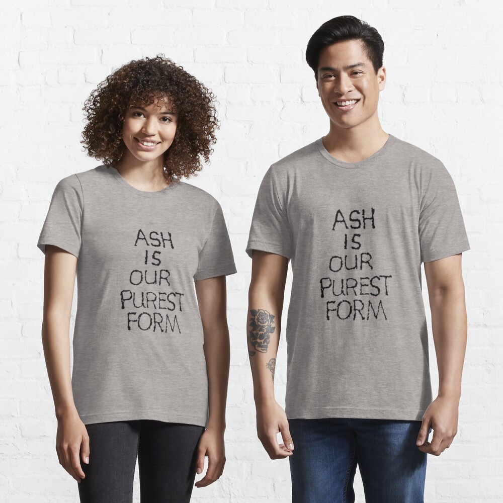
Gray Ash is a cool, light gray with a simple yet sophisticated look that is perfect for custom-printed t-shirts. It has a soft, comfortable feel and is the perfect base for printed designs to stand out. This color is also versatile and suitable for both casual and professional looks.
Pro tips: pair with black or dark blue ink for a sharp contrast. For a softer look, pastel blue, dark gray, or lavender ink will create a soft harmony while still interesting.
10. Forest Green
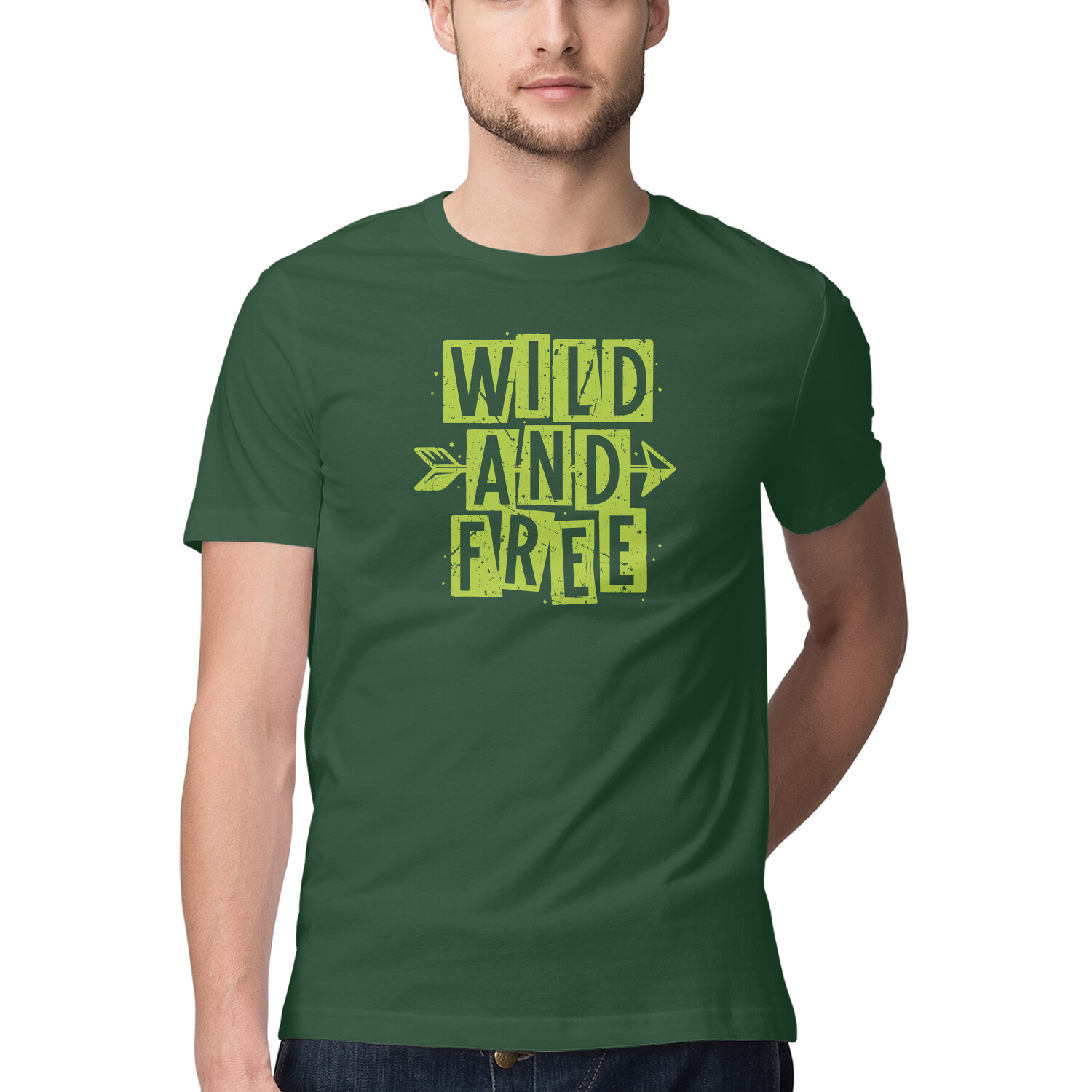
Forest Green is a deep green, similar to the green of the forest, bringing a fresh and strong natural beauty. This tone creates a peaceful, pleasant feeling and is very suitable for custom-printed t-shirt products. This color is not only a perfect choice for designs close to nature but also brings elegance to those who love classic or modern style.
Pro tips: combine with light yellow, white, or gray ink to create an impressive highlight. If you want a warmer design, earthy brown or beige ink will create a gentle harmony while still keeping sophistication.
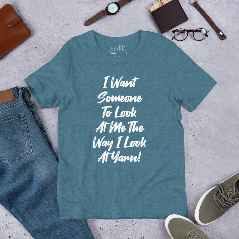
11. Heather Deep Teal
Heather Deep Teal is a deep blue with a green undertone, creating a mysterious and modern look. This color has the perfect combination of the depth of blue and the freshness of green, bringing a relaxed and attractive feeling. It’s a subtle beauty that is not too heavy but still strong enough to attract attention.
Pro tips: mix with pale yellow, white, or silver ink to make a great contrast. If you want a softer look, light gray, light purple or pastel pink ink will create harmony.
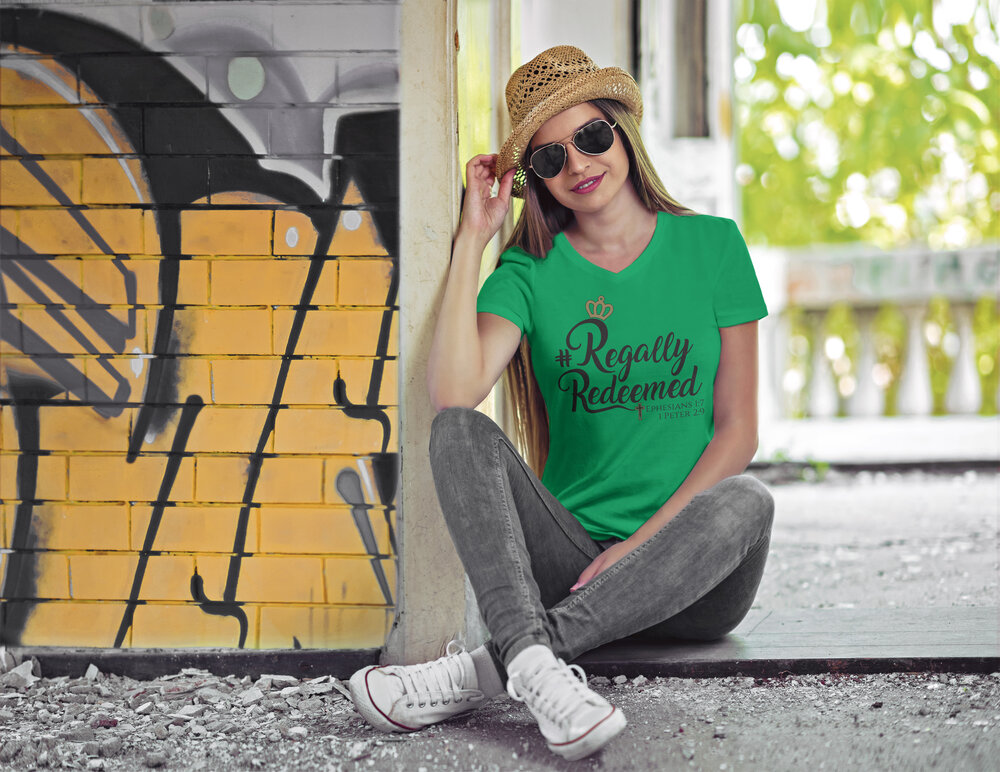
12. Kelly Green
Kelly Green is a vibrant medium green that has energy and enthusiasm, suitable for custom printed t-shirt designs. This color is fresh and vibrant which easily grabs attention and strong impression. It’s named after a popular Irish family and exudes images of the lush green landscapes of Ireland. This color is perfect for fun, youthful, and light designs.
Pro tips: it can be mixed with white, black, or yellow ink. If you want a softer look, you can use some other colors like light gray, pastel blue, or light pink ink.
13. Red
The next color to appear in this list is red. This color is powerful, passionate, and outstanding. In a study examining color preferences by Reich and Carbon (2014) for t-shirts, red was identified as the most preferred hue with 31.8% of participants choosing it. It easily attracts attention and makes a lasting impression, making it ideal for custom-printed t-shirts. Red not only exudes confidence and boldness but also evokes feelings of warmth and energy, making it perfect for designs with a strong message.
Pro tips: you can mix a red t-shirt with white, black, or yellow ink to make designs stand out. Additionally, gray, navy, or pale pink ink will create a harmonious balance for the shirt overview.
14. Pink
Light pink or pastel pink looks bright and youthful which evokes a romantic feel. This color is reminiscent of the Y2K era when pink was all the rage in 2000s fashion. With the Y2K trend making a strong comeback, pink is becoming increasingly popular, becoming an indispensable element in the wardrobes of fashionistas. Pink is perfect for custom-printed t-shirt designs, making it easy for your brand to attract young customers.
Pro tips: combine different shades of pink to create a beautiful balance and harmony. Apart from that, try combining it with white or yellow ink to highlight the design and create sophisticated, attractive products.
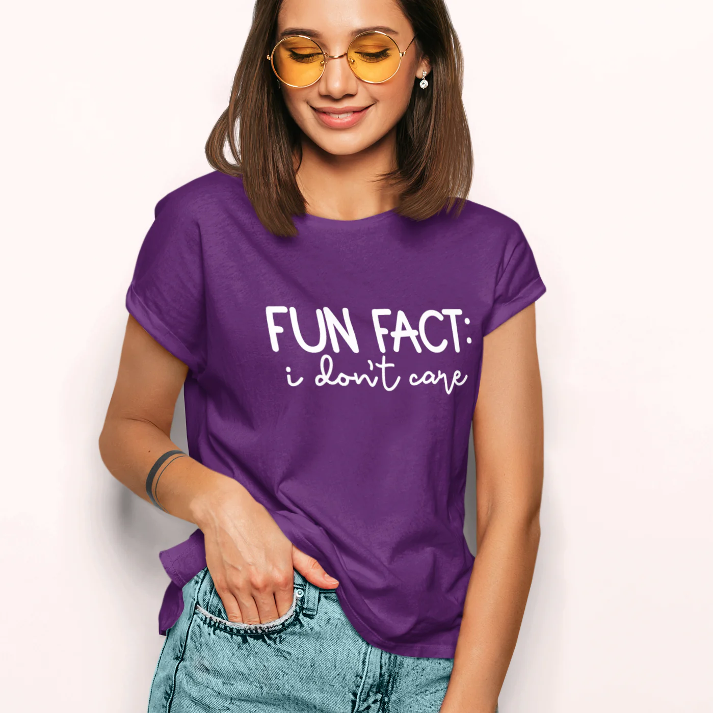
15. Purple
Purple looks quite charming and brings a luxurious and dreamy look. With a combination of artistry and elegance, this color is very suitable for custom printed t-shirt designs, creating a strong impression but still youthful and modern.
On the other hand, light purple or pastel purple is making a strong comeback in retro and vintage fashion trends, highlighting the dreamy beauty. To attract customers who love sophisticated style, don’t forget to add purple designs to your collection.
Pro tips: combine different shades of purple to create a subtle harmony. Or use white, light yellow, or silver ink to highlight the design, creating products that are both beautiful and impressive.
16. Yellow
Yellow brings a bright and energetic feel to custom-printed t-shirts. It is a strong attention grabber and brings a positive, optimistic feeling to the wearer. Not only is this color symbolic of light and summer, but it also helps create striking and memorable designs.
Pro tips: using black ink on yellow t-shirts can create a strong contrast that makes your design stand out, whether it is typography or illustration. You can also choose other options such as navy blue, dark green, and dark purple. These color combinations create a beautiful contrast without overwhelming the bright yellow.
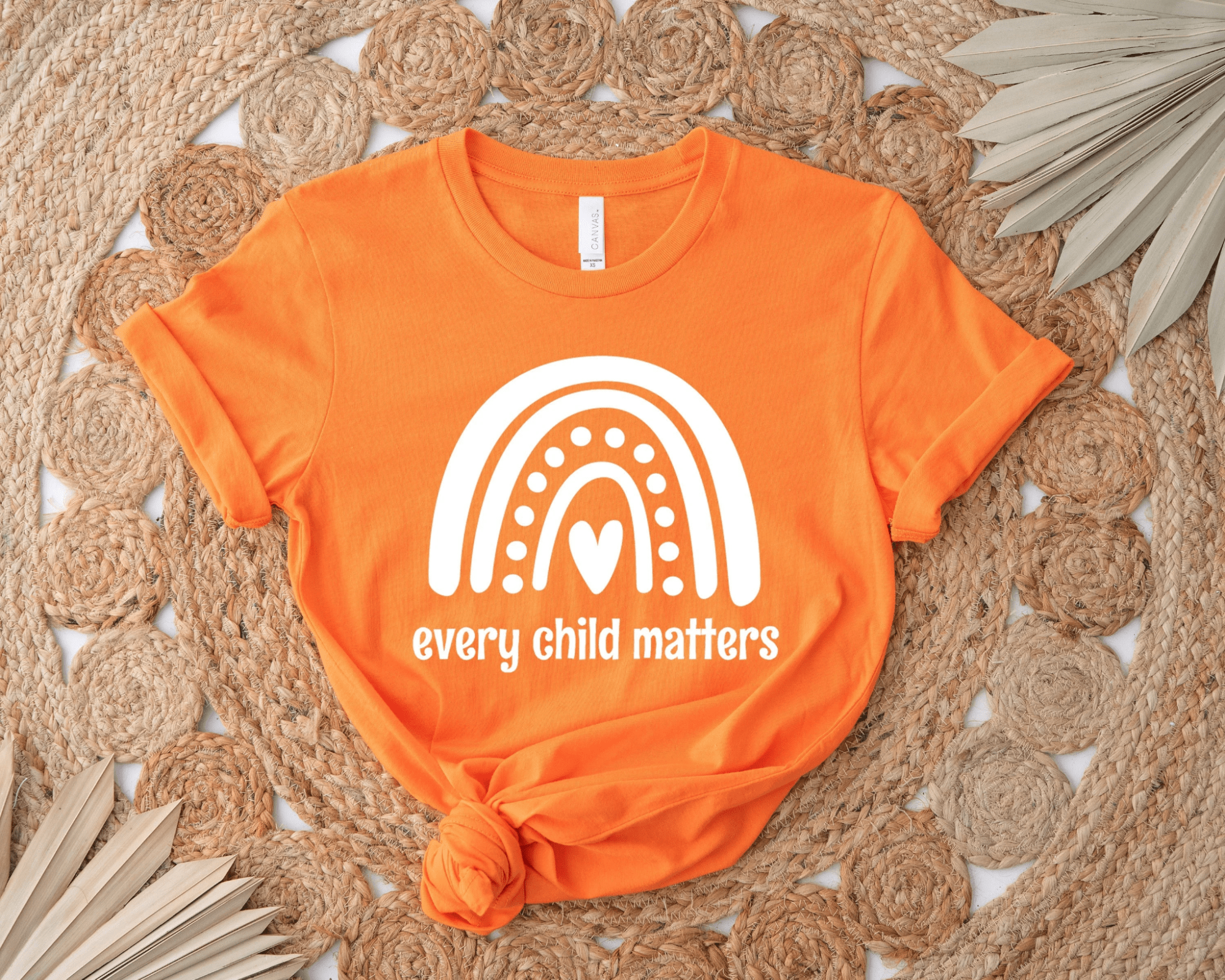
17. Orange
Orange is a bright, vibrant, and energetic color that exudes a sense of freshness and fun. When you wear this color, you will definitely attract attention immediately. A bold orange T-shirt is an ideal choice for those who want to be different and stand out from the crowd. In particular, this is also the perfect color for summer.
Pro tips: to highlight the design, you can use black, white, or green-blue ink to create a strong contrast. Since orange is quite bright, choose a darker green or blue tone to keep the design balanced.
Predict Trendy Colors for T-shirts for 2025-2026
Brat Green
Brat Green, identified as a bright lime green shade (Pantone 3507C), emerged as a cultural icon in 2024, primarily due to its association with Charli XCX’s album Brat. The color, featured on the album cover, became synonymous with a bold, unapologetic aesthetic that massively influenced fashion and beauty. According to People and Vogue, Brat Green was the color of summer 2024.
By 2025, Brat Green has slowly lost its edge, yet not disappeared. Fashion trend reports, such as Refinery29, suggest a pivot to quieter greens, referred to as “frog green," with grassy hues seen on runways. This shift aligns with the broader 2025 color palette, which favors more subdued, earthy tones.
For T-shirt designs: Use Brat Green for bold, edgy, funny Y2K-inspired collections, or nostalgia merch tied to music and pop culture. Stay true to the Brat fashion, just put an bold statement in Arial font on a Brat green blank t-shirt and you will get the designs that Gen Z and chronically online audiences love.
Olive Green
Olive Green, a muted, khaki-like green, has solidified its position as a major trend in 2025 across streetwear staples to high-end runways, reported by famous fashion magazines like Glamour and British Vogue.
Olive’s rise ties directly to the growing sustainability movement and a return to nature-inspired palettes. It’s functional, flattering, and highly wearable. This color is also highly applicable on daily wear fashion.
Olive Green works beautifully in military, outdoor, or earth-conscious niches. Consider pairing it with vintage illustrations, topographic map graphics, or rugged slogans. It’s also a perfect base for tone-on-tone embroidery or eco-conscious messaging, thanks to its natural vibe.
Burgundy
Red was a big trend in the past years. And in 2025, this trend is going to channel into Burgundy, a deeper, moody shade. Search data shows consistent interest in “burgundy" throughout 2025. Especially during the colder months, it is likely that this color is going to take over everyone’s wardrobe.
This color is perfect for gothic style or academiccore designs. It also goes well with the festive season themes. If you are looking for the right shade for your Christmas collection, don’t overlook this Burgundy trend.
You can use serif fonts, embroidered crests, or Renaissance-inspired art to give your burgundy tees that elevated feel. For a bolder take, mix with gold foil or velvet-print textures.
Butter Yellow
Butter Yellow, a soft, creamy yellow, has emerged as a standout trend in 2025, particularly for spring and summer, driven by its warm, optimistic, and nostalgic qualities. Harper’s Bazaar, also describe Butter Yellow as a “runway mainstay."
Search trends show a significant increase in “butter yellow" searches, particularly in fashion and home decor, with Pinterest and Instagram posts tagged #ButterYellowTrend surging. This widespread adoption reflects its appeal as a cheerful, versatile color, aligning with the dopamine decorating trend.
Butter Yellow thrives in positive, wellness-oriented niches. Think motivational quotes, feel-good characters, or vintage travel illustrations. Pair it with faded oranges, pastel pinks, or bold red accents to avoid it looking washed out. Works great for yoga wear, baby apparel, or mental health advocacy merch.
Mocha Mousse: Pantone’s 2025 Color of the Year
Say hello to Pantone’s 2025 Color of the Year. Mocha Mousse is a velvety brown that’s warm, grounding, and surprisingly versatile. Whether you’re designing lounge sets or upscale streetwear, this neutral brown brings a modern edge to classic minimalism.
People are craving comfort—and this color delivers. It evokes the feeling of sipping a latte on a cozy couch, while still looking elevated enough for everyday wear. It’s also gender-neutral and seasonless, making it ideal for a wide audience.
Mocha Mousse is your go-to for neutral streetwear, minimalist designs, and loungewear collections. Add interest with textured typography, subtle tone-on-tone prints, or hand-drawn line art. Great for unisex collections or slow fashion brands focusing on longevity.
How to Choose the Best T-Shirt Colors for Different Audiences
Choosing the right color to sell is not only based on trends but also on understanding the psychology and preferences of your target customer base. Here are some tips to help you select the most suitable t-shirt color for your POD business.
Understand Color Psychology
Do you know that colors evoke certain emotions and can influence customer purchasing behavior? Different colors can evoke different emotions and perceptions, so it is essential to choose colors that are appropriate for your brand or message. By understanding the psychological effects of different colors, POD sellers can strategically select colors that match the desired mood or message of their t-shirt design.
For example, warm colors like red, orange, and yellow are often associated with energy, excitement, and warmth, while cool colors like blue, green, and purple tend to create feelings of calm, peace, and stability.
Consider Your Audience
Before deciding on a t-shirt color, consider your target audience. Different demographics may prefer certain colors over others.
- Age: Each generation has its own color preferences. Young people, such as Gen Z and Millennials, are often attracted to bright, bold, and vibrant colors, which match their dynamic nature. Meanwhile, older people prefer soft, neutral tones, which bring a sense of sophistication and calmness.
- Gender Preference: Although color preferences are less tied to gender these days, research shows that men tend to prefer blues and greens, which represent stability, while women may lean toward purples, pinks, or pastels, which represent gentleness. However, personal preferences are becoming more diverse and relaxed.
- Culture: Colors have different meanings depending on cultural context. For example, white in the West symbolizes purity and is associated with weddings, but in many Eastern cultures, it is associated with funerals. Similarly, red brings good luck in China but may have different meanings elsewhere. Understanding these associations helps your designs communicate effectively and avoid unwanted messages.
By research in-depth research on your target customer base, you can create the right color options.
Match Colors with Designs
Choosing the right color combination is important in t-shirt design to create a strong visual impact. Using contrasting colors is an effective way to enhance aesthetics, attract attention, and make a design stand out. Besides, opposite colors on the color wheel can create depth and visual tension, making a design more impressive and memorable.
In addition to being aesthetically pleasing, contrast can also help convey messages and evoke emotions. For example, combining warm bright colors with cool dark colors creates dynamic harmony, while combining bright colors with soft or neutral colors creates a sense of calm. By understanding color psychology, you can use contrast to communicate messages effectively.
Follow Seasonal Trends
Keeping up with new color trends can make your designs feel fresh and up-to-date. However, ensure that you don’t lose your brand identity when following these trends.
- Popular Color Schemes: Learn about current color trends in the fashion industry. There are some sources like Pantone and WGSN, that are valuable sources of information that will help you stay on top of the latest color trends to make your designs more appealing and relevant.
- Seasonal Color Trends: Consider incorporating seasonal colors into your designs. For example, pastel tones are popular in spring because they are light and refreshing, while warm, deep colors like deep reds and earthy oranges are great for fall.
Test and Collect Customer Feedback
Once you’ve narrowed down your color choices, consider testing them on your target audience or gathering feedback from friends and colleagues. Here are two ways that you can do:
- A/B test with color: Create multiple versions of your design with different color combinations and run A/B tests. This will help you understand which version appeals and resonates best with your target audience.
- Gather user feedback: Use surveys or focus groups to hear from your audience. This feedback is useful for evaluating how your color choices affect the overall feel and impression of your design.
By incorporating these methods, you can fine-tune your color selections and ensure that your design not only stands out but also connects with your audience in a meaningful way.
Diversity Kind of T-shirt
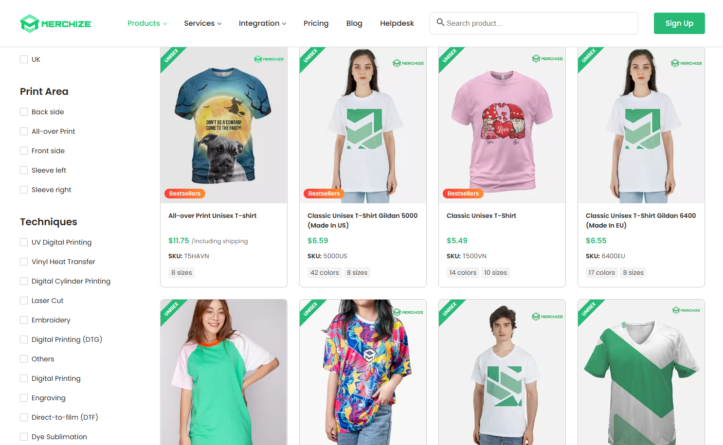
While choosing the color of your t-shirt is important, choosing the style of the t-shirt is essential. Merchize offers a wide range of popular t-shirt styles and integrates easily with major e-commerce sales channels. You don’t have to worry about managing products, packaging, and inventory, you just need to focus on designing and promoting products.
Explore our top-quality print on demand t-shirt types and choose the best suits your design.
FAQs
1. What colors are best for screen printing?
In screen printing, bright and high-contrast colors often produce the best results because they stand out against the fabric and are easy to see. Some colors like white, yellow, blue, and red are popular choices because they produce sharp, clear images. For dark fabric backgrounds, bright or white inks can ensure the image does not disappear. Finally, choose an ink color that contrasts well with the fabric color so that your design stands out.
2. What t-shirt colors are most versatile?
The most versatile t-shirt colors are white, black, and gray. These colors go well with almost any design and mix with other colors easily, making them suitable for many occasions. White t-shirts create the perfect backdrop for vibrant designs, while black t-shirts help to highlight bright or pastel designs. Neutral gray is also a great choice because it never goes out of style and is suitable for different customer bases.
3. How can I choose the right color for my brand?
To choose the right colors for your brand, follow these steps:
- Understand the meaning of colors: Each color conveys different emotions and messages. For example, green can bring a feeling of nature and freshness, while red can evoke a feeling of dynamism and power. Choose colors that truly reflect your brand values and message.
- Consider your target audience: Research your target customers’ tastes and color preferences. This will help you choose colors that appeal to them.
- Keep it consistent: Once you have chosen a primary color palette, keep it consistent across your brand’s designs and products. This will help strengthen your brand recognition.
- Test and adjust: Don’t be afraid to experiment with different color combinations and gather feedback from your customers. This can help you refine and choose the perfect color palette for your brand.
