Contents
- 1. Monogram Logos
- 2. Wordmark Logos
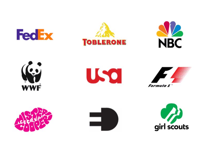
- 3. Pictorial Marks
- 4. Abstract Logo Marks
- 5. Mascot Logos
- 6. Combination Marks
- 7. Emblem Logos
- 8. Dynamic Logos
- 9. Animated Wordmarks
- 10. Negative Space Pictorials
- How to choose the right logo for your business niche
- Things to consider when choosing the right logo for your business
When starting an online store, the logo is usually one of the first things that makes many sellers wonder. Should you choose a text logo, a symbol, or combine both to be both professional and memorable? Understanding different types of logo will help you choose the right style for your brand identity, increase recognition, and ensure your logo works well on websites, social media, product packaging, or print designs. In this article, you will discover the most popular logo types and how to choose the right logo for your business.
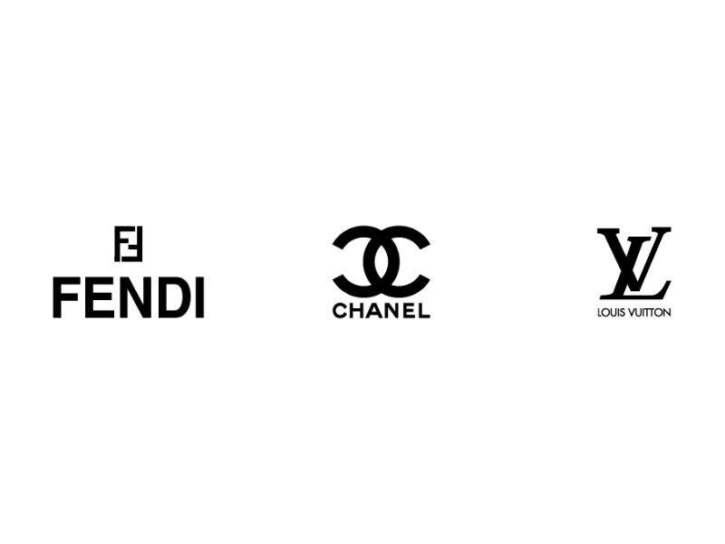
1. Monogram Logos
Simply, a monogram logo is created by combining the initials of a brand name. It is a typography-based logo style that follows a minimalist design approach.
This type of logo is a practical solution for brands with long or complicated names, making them much easier to read and remember. Just compare “Cable News Network” with its shortened version, “CNN,” and the difference in brand recognition becomes obvious.
For monogram logos, the font is the heart of the design. You need a typeface that reflects your brand’s personality while remaining clear and sharp across different marketing materials and product labels.
When should you choose a monogram logo?
- Your store name is too long: You need an abbreviation that customers can easily remember.
- You often use small print areas: Such as clothing tags, stickers, business cards, or pens.
- You want a professional image: Ideal for brands aiming for a clean, trustworthy, and serious identity.
Design tips
- Font: Choose simple fonts with strong, clear strokes, such as Serif or Sans-serif. Avoid overly decorative fonts because they can become difficult to read when scaled down.
- Color: Stick to monochrome colors like black, white, or navy. Use only one accent color if needed.
Tip for new stores: If your brand is still unknown, place the full store name below the monogram. This helps customers remember both the logo and your brand name during the early stages of growth.
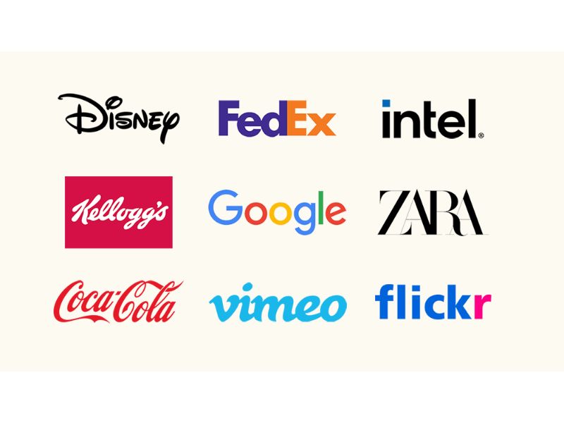
2. Wordmark Logos
A wordmark logo focuses entirely on displaying the brand name using a distinctive typeface, without any icon or symbol. This style works best when your store name is short, simple, and easy to remember. Well-known examples include Google and Coca-Cola.
With a wordmark logo, the font tells customers who you are. Your choice of typeface directly shapes how people perceive your brand. For example, fashion and beauty brands often use elegant, lightweight fonts to create a premium feel. On the other hand, law firms and professional service providers tend to use bold, structured fonts to communicate trust and stability.
When should you choose a wordmark logo?
- You are launching a new brand: You want customers to focus on remembering your store name.
- Your store name is short and memorable: Customers can quickly read it on signs, packaging, or advertisements.
- You need strong consistency: The logo should look clear and consistent across digital and printed materials.
Design tips
- Create a custom touch: Adjust letter spacing or modify certain characters to make the logo unique and more memorable.
- Use white space wisely: Combine a primary color with enough surrounding space to keep the logo clean and readable on all materials.
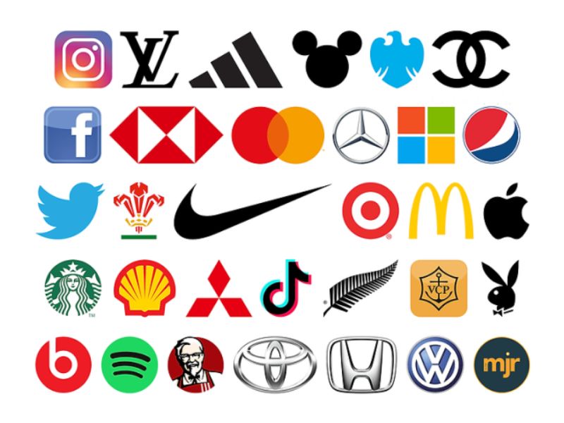
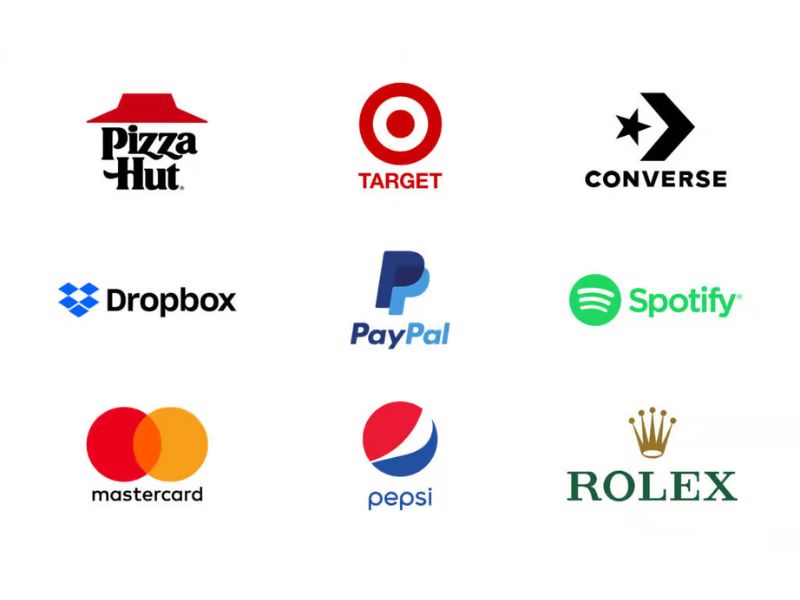
3. Pictorial Marks
Unlike wordmarks, pictorial marks use a recognizable image or symbol to represent a brand instead of text. Famous examples include Apple’s bitten apple icon and Target’s bullseye symbol.
The challenge of this logo type is that the symbol must carry the entire brand message on its own. For new sellers, this can be difficult because customers may not yet know what the business offers. That is why the chosen image should be clear, meaningful, and flexible enough to support the brand as it grows.
When should you choose a pictorial mark?
- You plan to sell globally: A visual symbol can overcome language barriers and be recognized across different markets.
- Your brand name is difficult to read or translate: A strong visual icon can be easier to remember than a complex name.
- Your core product or service is well-defined: Your business focuses on a clear offering that is unlikely to change significantly over time.
Design tips
- Keep it simple: Use bold shapes and limit your color palette to one or two strong colors. This makes the logo easier to reproduce across different materials.
- Use a simple supporting font: If you include your store name alongside the icon, choose a clean Sans-serif font so it does not compete with the symbol for attention.
4. Abstract Logo Marks
Abstract logo marks are a special variation of symbol-based logos. Instead of using recognizable real-world objects such as an apple or a bird, abstract logos rely on unique geometric shapes and stylized forms to represent a brand. Well-known examples include Pepsi’s three-color sphere and Adidas’ three-stripe symbol.
The biggest advantage of this logo style is its ability to capture the entire spirit of a brand in a single visual mark. It gives your store a unique identity that stands out from competitors and is not limited by any existing visual conventions.
![]()
When should you choose an abstract logo?
- You plan to expand into different product categories: You do not want your logo to be tied to a specific product, making future expansion easier.
- You want to communicate emotions and values: You prefer customers to remember your brand through its mission, personality, or message rather than through a literal product image.
- You operate in multiple countries: You need a symbol that can work across cultures without being misunderstood.
Design tips
- Let colors tell the story: Since the shapes themselves are abstract, use color psychology or gradients to create the emotions that match your brand personality.
- Pair it with a clean typeface: A modern, minimalist font works best alongside an abstract symbol, creating a professional look while helping customers recognize your store name.
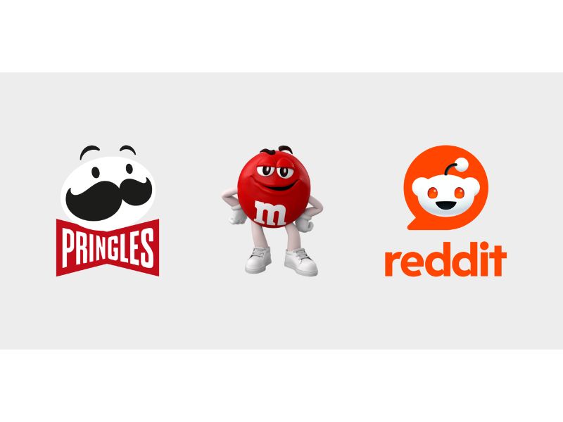
5. Mascot Logos
A mascot logo uses a detailed illustrated character to represent a brand. These characters are often fun, colorful, and full of personality, giving your business a memorable spokesperson that attracts attention. Famous examples include Colonel Sanders from KFC and Duolingo’s playful green owl.
The biggest strength of mascot logos is their ability to build strong emotional connections, especially on social media platforms such as Facebook, TikTok, and Instagram. Content featuring a recognizable character often generates higher engagement because people naturally connect with personalities.
When should you choose a mascot logo?
- Your target audience includes families and children: Perfect for toy stores, children’s fashion brands, snack businesses, or family-friendly products.
- You focus on social media branding: You plan to create video content and use a mascot in marketing campaigns or community events.
- You want stronger local brand recognition: A friendly character can help customers remember your business in a crowded market.
Design tips
- Colors and typography: Use warm, bright colors and rounded fonts to create a friendly and approachable image.
- Create a simplified version: Design a less detailed version of the mascot for small applications such as profile pictures, labels, or tiny product tags where fine details may not be visible.
6. Combination Marks
As the name suggests, a combination mark blends a wordmark with a visual element, which may be a pictorial symbol, an abstract icon, or a mascot. These elements can be stacked, placed side by side, or integrated into a unified design. Popular examples include Burger King and Red Bull.
This is often considered the most versatile logo type and one of the safest choices for e-commerce businesses. By combining text and imagery, it strengthens brand recognition and helps customers remember your store more easily. As your brand grows, you can even use the symbol on its own while customers still recognize your business. Combination marks are also generally easier to register as trademarks.
When should you choose a combination mark?
- You need a flexible logo system: Your logo must work across different formats, from tiny social media avatars to packaging tape and large storefront signs.
- You have a long-term branding strategy: You want to use both text and imagery to build recognition early on, with the option to separate the icon later.
- You use multiple layouts: You need a logo that can adapt to horizontal formats for website headers and vertical formats for social media profiles.
Design tips
Use stronger, more vibrant colors for the icon, while keeping the text in more neutral tones. This creates visual balance and ensures that the two elements complement each other rather than competing for attention.
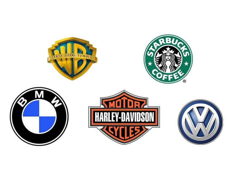
7. Emblem Logos
An emblem logo places the brand name inside a closed shape, such as a badge, seal, crest, or traditional emblem. This design style has a classic, formal, and trustworthy feel, making it popular among universities, automotive brands, and companies such as Starbucks.
However, because the text and graphic elements are tightly combined into a single design, emblem logos can be less flexible than other logo types. If a highly detailed emblem is embroidered on uniforms or printed on small business cards, the fine details may become blurry or difficult to read.
When should you choose an emblem logo?
- You want to highlight tradition and heritage: Ideal for handmade crafts, leather goods, coffee shops, tea brands, or businesses with a vintage image.
- Your products use label-based packaging: Works especially well on bottles, gift boxes, paper bags, and product stickers where a badge-style logo looks natural and professional.
Design tips
- Prioritize clarity: Avoid overly thin lines because they may disappear during printing. Choose a classic Serif font or a simple Sans-serif font to maintain readability at smaller sizes.
- Create a secondary badge: Prepare a simplified version of the logo, such as the icon alone or the brand’s initials, for mobile screens and small-format applications.
8. Dynamic Logos
Do not confuse dynamic logos with animated logos. A dynamic logo is a logo system that allows certain elements, such as colors, patterns, or layouts, to change depending on where the logo appears, while keeping the core visual identity intact.
In e-commerce, this approach is especially useful for brands selling across multiple channels. Instead of forcing one logo design into every format, a dynamic logo system allows your brand to stay clear and recognizable on websites, social media profiles, packaging, and other touchpoints.
When should you choose a dynamic logo?
- You sell across multiple platforms: You need a logo that adapts smoothly to websites, social media profiles, signage, and packaging while maintaining brand consistency.
- You frequently run campaigns or seasonal promotions: You want to refresh the logo for holidays, special events, or product launches without changing the core identity.
- Your logo appears in many different sizes: You need a minimal version for small spaces, such as a favicon, and a full version for larger applications, such as shipping boxes.
Design tips
The golden rule is simple: change the supporting elements, but keep the core elements consistent. Too many changes can confuse customers and weaken brand recognition.
9. Animated Wordmarks
Animated wordmarks are a digital-first evolution of traditional wordmark logos. Instead of remaining static, the text comes to life through motion effects such as sliding letters, smooth reveals, or subtle transformations.
A well-designed animation can make your store appear more modern, professional, and confident, especially when used in video marketing.
One important lesson: animation only exists in digital environments. You must still have a strong static version of the logo for packaging, labels, and printed materials. If a logo only looks good when animated but becomes ordinary or unreadable when still, it is more of a visual effect than a true brand logo.
When should you choose an animated wordmark?
- You focus heavily on video content: Perfect for TikTok, YouTube, Reels, and short-form advertisements where an animated logo can make intros and outros look more professional.
- You want to enhance website experience: A subtle logo animation can create a memorable first impression without distracting visitors.
- You are launching a new product or campaign: Motion effects can increase excitement and visual impact during major announcements.
Design tips
Keep the animation short and subtle, ideally between two and three seconds. Overly complex animations can distract customers and take attention away from the shopping experience.
10. Negative Space Pictorials
Negative space logos are one of the most creative forms of logo design. They use the empty space around or within shapes to create a hidden secondary image or message. When customers discover this hidden detail, it often creates a memorable and engaging experience that strengthens brand recognition.
For sellers, negative space logos also offer practical benefits. Because they rely on shape contrast rather than decorative effects, they usually print more clearly, reproduce well in one color, and require less ink than complex logo designs.
When should you choose a negative space logo?
- You want to reduce printing costs: The logo can look impressive even in a single color without gradients or special effects.
- You need maximum clarity: The design remains sharp and recognizable even when reduced to a small icon size.
- You rely heavily on packaging labels: High contrast makes the logo easy to identify at a glance on shipping boxes, stickers, and product tags.
Design tips
If you choose a negative space logo, always test it at a very small size, such as on a business card or clothing tag. If the hidden elements become unclear or disappear, ask your designer to simplify the shapes or enlarge the negative space before moving into large-scale production.
How to choose the right logo for your business niche
Every industry has its own unique products, target audience, and packaging requirements. That is why choosing the right logo style is an important part of building a strong and recognizable brand.
Quick summary
| Logo Type | Core Characteristics | Best For |
|---|---|---|
| Monogram | Uses the initials of the brand name (e.g., CNN, HP). | Stores with long names; businesses that often print on small items such as clothing tags, pens, or stickers. |
| Wordmark | Focuses entirely on the brand name using a distinctive typeface (e.g., Google). | New stores that want customers to remember the brand name; businesses with short, easy-to-read names. |
| Pictorial Mark | Uses a recognizable image or symbol (e.g., Apple, Target). | Global businesses; brands with difficult-to-pronounce names; stores with a clear core product. |
| Abstract Logo | Uses stylized geometric shapes that do not exist in real life (e.g., Pepsi, Adidas). | Multi-category businesses; brands that want to communicate emotions, values, or ideas rather than literal products. |
| Mascot Logo | Features a character that represents the brand (e.g., KFC, Duolingo). | Children’s products, family-focused brands, snack businesses, and stores active on TikTok or Reels. |
| Combination Mark | Combines text with a symbol, icon, or mascot (e.g., Burger King, Red Bull). | The most versatile option for sellers; ideal for long-term, multi-channel branding. |
| Emblem Logo | Places text inside a badge, seal, or enclosed shape (e.g., Starbucks, Harvard). | Handmade goods, leather products, vintage cafés, and brands that use labels on bottles or gift boxes. |
| Dynamic Logo | Keeps the core identity while changing colors, patterns, or layouts depending on usage. | Multi-platform sellers and brands that frequently update campaigns for holidays or seasonal events. |
| Animated Wordmark | A text-based logo with motion effects for digital platforms. | Businesses focused on video marketing and modern website experiences. |
| Negative Space Logo | Uses empty space to create a hidden secondary image or meaning. | Sellers looking to reduce printing costs while maintaining a creative and memorable identity. |
1. Fashion, Beauty, and Luxury Products
To create a premium and sophisticated image, businesses in these industries typically favor minimalist logo styles such as wordmarks and monograms. Elegant typography combined with classic colors like black, white, or beige helps communicate exclusivity and quality.
This approach also works exceptionally well on product packaging, clothing tags, shopping bags, and cosmetic containers because it looks refined while keeping printing costs under control.
2. Food, Beverage, and Handmade Products
Emblem logos are a popular choice for businesses in these categories because they create a sense of authenticity, tradition, and craftsmanship. They work especially well on bottles, paper boxes, jars, and packaging labels.
When working with a designer, choose bold and clear lines while avoiding overly delicate details. This ensures the logo remains readable when printed on small stickers or packaging labels.
3. Family, Kids, and Toy Products
A colorful and friendly mascot can help a brand quickly connect with both children and parents. Mascot logos are particularly effective for social media marketing, short-form videos, and creating memorable unboxing experiences.
It is also a good idea to create a simplified version of the mascot for small applications such as profile pictures, mobile icons, and product tags.
4. Education, Organizations, and Professional Services
Trust and professionalism are the most important qualities in these industries, making monogram and emblem logos strong choices. The logo should work consistently across business cards, letterheads, membership cards, uniforms, and other professional materials.
Choose structured, easy-to-read fonts and dependable colors such as navy blue, gray, or black to reinforce credibility and stability.
5. Dropshipping, General Stores, and Technology Businesses
For businesses that sell across multiple platforms or international markets, combination marks are often the most practical solution. The visual symbol helps overcome language barriers, while the brand name strengthens recognition.
This flexibility also allows you to use different versions of the logo for different purposes. The full logo can appear on website banners and shipping boxes, while the icon alone can be used for social media profiles, mobile apps, or packaging tape.
Things to consider when choosing the right logo for your business
Before designing a logo, you should first define its primary purpose. If your goal is to help customers remember your store name, text-based logos such as wordmarks and monograms are often the best choice. On the other hand, if you want to communicate a unique brand personality or build trust, pictorial symbols, abstract marks, or emblem logos may be more effective.
The places where your logo will appear most often should also influence its design. Think about whether your logo will mainly be displayed on mobile screens, business cards, product packaging, shipping boxes, or clothing tags. Choosing the right structure from the start helps prevent situations where a logo looks great online but loses clarity when printed.
Customer behavior is another important factor to consider. If most people discover your business through social media, your logo must remain sharp and recognizable even as a small profile picture. If you operate a physical store, however, a logo with a clear and readable name may be more valuable because it can attract attention from a distance.
Your long-term business goals should also play a role in logo selection. A highly detailed pictorial logo tied to a specific product may limit future growth if you decide to expand into new categories. More flexible options, such as abstract logos or combination marks, give your brand room to evolve without requiring a complete redesign later.
Finally, a practical logo should come with a flexible branding system. Ideally, you should have a full version, a simplified version, and a black-and-white version of the logo. This ensures your brand remains consistent across all touchpoints, from digital platforms to everyday packaging and printed materials.
There is no single “best" type of logo. The right choice depends on your budget, products, target audience, and sales channels. By understanding the different types of logos and their strengths, you can select a design that supports your brand today while giving it room to grow in the future.


