9. Early access privileges for priority customers
This design idea builds a sense of respect and exclusivity for loyal customers or early subscribers. Visuals lean toward a minimal yet refined style featuring gold key icons, glowing VIP cards, or opening doors. The image messaging asserts that holders of this design will step into the shopping space ahead of the rest of the market, easily securing high-quality items.
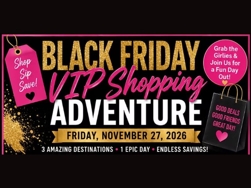
10. Premium shopping experience for VIP clients
Unlike mass discount ads with a hurried feel, the VIP design concept targets sophistication, luxury, and distinct privileges. The color scheme focuses on deep black combined with gold or silver paired with refined Serif fonts. This idea delivers the message of hidden offers not publicly broadcasted, making customers feel like they belong to an elite shopping club receiving special care from the brand.
11. Teaser messaging via email to spark curiosity
This idea is designed to build positive anticipation from the community before the official launch date. The image layout takes a “poker face" approach—revealing a portion of product details hidden behind smoke, shadows, or subtle cuts. The combination of open questions and mysterious visuals strongly stimulates the eyes, prompting users to sign up for early notifications.
12. Building trust through user-generated content
This design concept places real images of consumers experiencing the product right at the center of the marketing asset. Instead of using polished yet distant studio shots, the design incorporates Polaroid-style frames, screenshots of personal posts, or candid everyday angles. The presence of real people and real emotions paired with Black Friday discount tags creates a relatable feel, reinforcing absolute trust and breaking down prejudices about “overhyped ads" during the sale season.
13. Reinforcing purchase decisions with real reviews
The design idea uses positive experiences from past buyers as direct sales leverage. The layout harmoniously balances the hero product with quote blocks highlighting 5-star customer reviews, framed prominently as a proof of quality. Seeing specific praise regarding product quality or service right next to deep discount prices helps buyers completely clear away final hesitations.
14. Holiday gift guide
This design concept thoroughly solves the customer’s pain point of “not knowing what to buy." Layouts are organized logically using grids or smart category cards, grouping products by budget or target recipient such as “Gifts for Him" or “Under $25 Ideas." A clear layout helps viewers easily map out their shopping list and make selection decisions much faster.
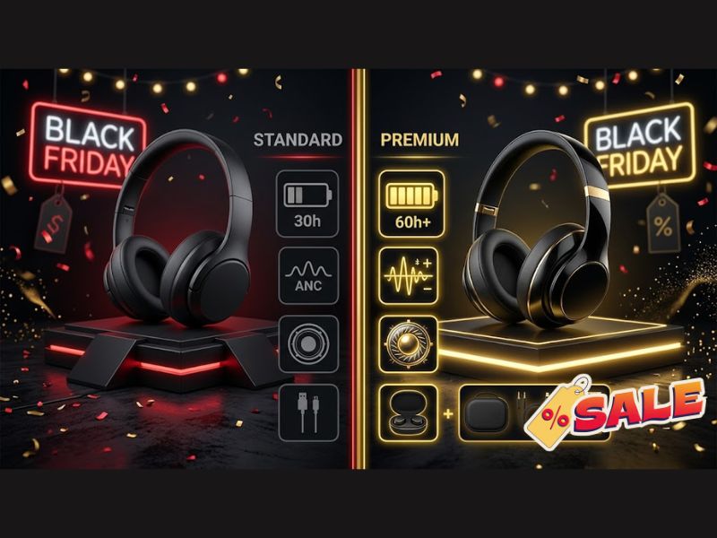
15. Visualizing value through product comparisons
This design concept uses a Split Screen layout to place two product versions or price points on a direct comparison scale. Visuals clearly display superior features, included extras, or savings figures when customers choose to upgrade during Black Friday. Making comparison data transparent with easy-to-understand graphics helps consumers instantly spot the most beneficial shopping option.
16. Proving transformation with Before and After effects
This design idea focuses directly on the results or magical transformations a product brings to users. Layouts use a clear dividing line in the middle to contrast two states: discomfort before use versus complete satisfaction after experiencing the product. Combining visual impact with attractive discount prices convinces customers that investing in the product is the best solution to improve their daily life.
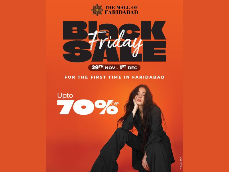
17. Minimalist approach to break through visual noise
In an ocean of vibrant ads, minimalist design stands out by creating breathing space for the viewer’s eyes. This concept strips away unnecessary decorative elements, retaining only a solid background paired with sharp, oversized typography and a single product image. High contrast and a clean structure allow the discount message to hit the viewer’s eye in under a second.
18. Festival energy burst with Neon Light style
Inspired by glowing neon signs on busy shopping streets at night, this design idea brings a vibrant look. Using neon tube lines emitting pink, neon green, or purple light over a deep dark background, the concept delivers a modern, energetic, and entertaining vibe. This design style is extremely effective at attracting younger target audiences.
19. Premium positioning with luxury textures
This concept elevates promotional materials to high-fashion standards, shattering the myth that Black Friday is only for budget items. Designs feature matte black, navy, or cream tones paired with sleek fonts and metallic glimmers. Products are honored with soft shadow lighting, helping brands convey a message of high-end value at a compelling price.
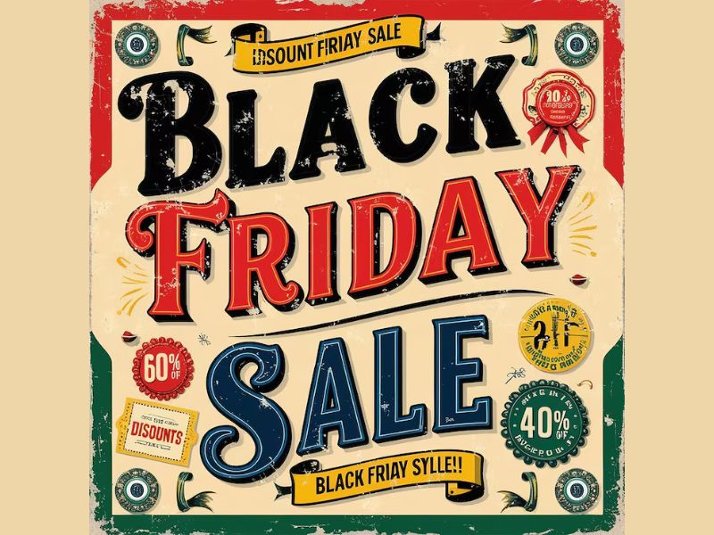
20. Nostalgic appeal with Retro style
This idea taps into nostalgic feelings through 80s and 90s aesthetic spaces. Designs prioritize Synthwave color palettes, glitch effects, classic computer fonts, and stylized geometric graphics. Blending nostalgic elements with modern shopping spirit helps brands create a distinct visual edge among thousands of standard ads.
21. Spreading human values through shared shopping
This idea connects discount campaigns with positive social values. Visuals emphasize warm tones and connecting symbols like hearts or caring hands. Image messaging clearly states that a portion of revenue will be donated to charity funds or environmental causes, helping buyers feel their spending carries real meaning.
22. Lowering barriers with zero-risk trial offers
The design focuses on breaking down customer hesitancy when trying new products or services. Visuals highlight guarantees such as “100% 30-Day Money Back" or “Free Trial" using glowing shield icons. A transparent, clean layout creates a sense of safety, encouraging users to make faster decisions.
23. Engaging customers with Gamification elements
This concept turns a standard ad into an engaging interactive game. Visuals adopt interfaces like lucky spin wheels, mystery scratch grids, or claw machines with lively colors. Injecting entertainment into the graphic extends customer dwell time and creates excitement as they “hunt" for discount codes.
24. Authentic peek behind the scenes
This idea brings viewers closer to the actual prep work powering the Black Friday rush. Visuals showcase team members packing orders, fully stocked warehouses, or detailed crafting processes. Authenticity in imagery builds natural trust and creates deep goodwill with shoppers.
25. Stockpile mindset activation with bulk buy deals
This concept targets the consumer’s need to stock up on goods at the end of the year. Visuals center on stacks of products, neatly arranged boxes, or overflowing shopping carts. Discounts scale up as quantity increases, directly motivating customers to add extra items to their cart to optimize total costs.
4 most successful Black Friday design trends
Conversion-focused minimalism
Minimalism continues to dominate online sales platforms. By stripping away clutter, the interface directs total buyer attention toward core elements: product details, discount offers, and the checkout button. This clean structure accelerates page load speeds while minimizing customer distraction during the shopping process.
High-impact directional typography
Bold, heavy, and oversized fonts have become a staple in Black Friday visual strategies. Striking typography delivers the discount message instantly, establishing a clear visual hierarchy that guides the viewer’s reading flow naturally.
Modern layout shaping through geometric blocks
Designers are increasingly using varied geometric shapes to structure display spaces, creating a sleek, post-modern aesthetic. Framing product shots, discount tags, and CTA buttons within geometric bounds keeps the layout organized and ensures smooth interaction on mobile screens.
Restrained palettes driving high contrast
Rather than overwhelming buyers with busy color schemes, top brands favor a highly selective, limited palette. Combining 2 to 3 high-contrast core shades makes key information pop off the background while maintaining strong brand identity alignment.
Common colors, borders, and fonts to prioritize for Black Friday promo visuals
Color palettes
Core shades such as black, red, gold, silver, and deep blue always take top priority. Red triggers a psychological effect around limited time and urges immediate buying action; gold evokes luxury and high quality; silver and deep blue bring trust and a modern feel.
Bold strokes and depth effects
Using thick borders (strokes) around text or graphics helps key details stand out completely against the background. Combining this technique with drop shadows creates visual depth, guiding the viewer’s eyes directly toward discount numbers or product names.
Modern, readable Sans-serif fonts
Sans-serif font families like Arial, Helvetica, Roboto, or Montserrat offer a modern, clean, and familiar look. The sharp readability of Sans-serif fonts across all mobile screen sizes allows users to catch the sales message in just a few seconds.
The power of black in Black Friday campaigns
The use of black in ad campaigns has become a default brand identifier, as the name “Black Friday" itself carries its signature shade. This color delivers a message of exclusive privileges, creating a classic, luxury feel that elevates brand positioning.
Using a black background provides clear commercial advantages for sellers:
-
Optimized visibility: A black backdrop serves as a neutral space, making supporting elements like light-colored text, vibrant product shots, and CTA buttons pop off the screen.
-
Encouraged conversion: Color psychology shows that deep dark shades build urgency and a sense of limited availability, prompting buyers to act faster to drive sales growth.
-
Enhanced brand identity: Black is timeless, never goes out of style, and effortlessly projects a professional, trustworthy image to consumers.
Key design tips for Black Friday visuals
Limit to a maximum of 4 content elements per frame
Cramming too much information into a small display area is the main reason customers scroll past your post. A high-converting design should focus strictly on 4 core details:
-
1 catchy headline: Directly conveys the discount percentage or the program’s biggest value proposition.
-
1 striking main visual: Acts as the primary visual touchpoint, capturing viewer attention within the first 3 seconds.
-
Brief supporting details: Clarify terms, timeline, or promo codes in 1 to 2 short sentences.
-
1 prominent CTA button: Guides the user’s next step, such as “Shop now," “Claim offer," or “Explore today."
Prioritize a clean, single-column layout
A simple layout lets readers digest information smoothly top-to-bottom without mental distraction. The standard flow starts with Headline → Main Visual → Brief Details → Call to Action. However, this structure can adapt flexibly across media channels:
-
For visual-centric platforms (like Instagram): Sellers should break content into carousel posts. Each slide handles a single element, keeping the background clean while increasing engagement time.
-
Optimizing post graphic space: Sellers can move the text headline into the post caption, dedicating the entire image space to products and branding to maintain high store aesthetics.
nvesting time to refine your store’s visuals will yield a noticeable difference in click-through rates and overall revenue this sales season. To prepare even further, don’t miss our comprehensive guide on top Black Friday marketing ideas tailored for sellers!
Visuals are the first touchpoint deciding whether customers scroll past or stop to spend money. Mastering trending Black Friday design ideas is the fastest path to set your store apart, retain buyers, and maximize every conversion opportunity. Investing time to refine your store’s visuals will yield a noticeable difference in click-through rates and overall revenue this sales season.