Prepare Artwork for Print: Template Guide
I. General Design Considerations:
These requirements apply to all of our products unless otherwise noted on the product specifically:
Download the product templates:
First off, you’ll need to download the Product Template, included in each product link.
(Scroll down to Mockup & Template section, then click here to download)
File Type:
- You can upload your design as a JPG & PNG with a maximum file size of 100MB.
Resolution/DPI:
- For great results, we recommend creating a high quality artwork at least 150 DPI. Avoid low quality images, to produce the best quality with bitmap/raster files, again, always save your design files at the highest resolution possible.
- Your image may lose detail and appear blurry / pixelated if it is enlarged too much. Remember, resizing or rescaling images only reduces the resolution of your images and is best avoided altogether.
Quality of the image if starting from a higher resolution original image. |
An extreme example of upscaling a small image to 3x size turns out blurry |
 | The Best Approach to Upscaling In our opinion, the best approach right now is using Photoshop’s Preserve Details 2.0 resampling. It works particularly well for solid areas, which you can then sharpen to improve them further (see Sharpening Edges). This Resampling option has been available since Photoshop CC 2018. If you can’t see it as an option, check it is enabled in the Technology Previews. If Photoshop isn’t an option, there are a number of image upscaling alternatives online you can try. With the increasing availability of AI driven software, upscaling is certainly a more viable option than it used to be. However, nothing beats having the original file as a high resolution image. |
Your RGB file will have to be converted to CMYK prior to printing. For artwork with transparency: Since .PNG files are only in RGB color space, we recommend creating your print files in CMYK and then converting them to an RGB color profile. To find out further information on CMYK vs RGB see this article to understand more on our digital printing or colour matching capabilities.
The most important thing to know is you cannot compare real world colours with colours on screen 100% reliably. Colors may look different on the printed item than they appear on your monitor. This may be due to different reasons:
- Every screen displays colors differently. A combination of brightness, contrast and saturation can change color effects significantly.
- The color of the fabrics has an effect on the print result.
- Plain black which is best for small areas less than 2cm2 such as text or logos. To achieve the best Black, use rich black which contains 100% black and 10% cyan and better for larger areas to ensure an even, dark coverage because any inconsistencies will be disguised by the second colour.
Artwork Details:
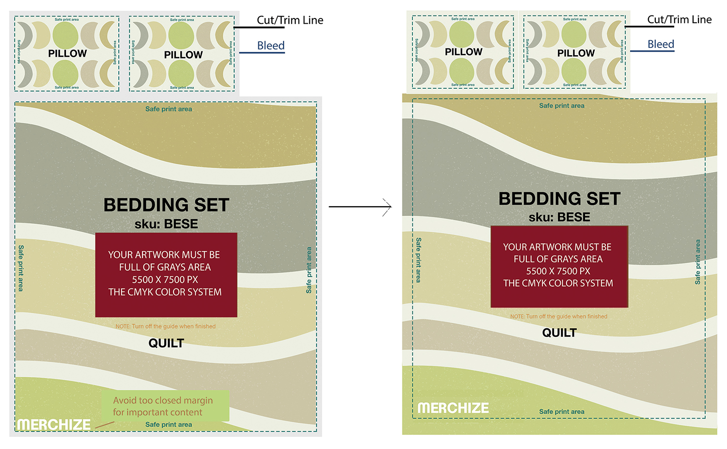
- When creating your design, any important content (text and graphics) should be placed within the Safe Print Area to avoid being trimmed due to the unavoidable shifts that may occur during the production process. The safety margin (extend from the trim line to the edges of important elements), we recommend is at least 5mm.
- Everything outside the safe print area is considered to be a bleed margin. You should extend your design to the edge of this area and covers the bleed area on all sides to prevent the appearance of irregular borders. Bleed is a seamless extension of the artwork.
- Smaller lines might disappear against a dark background as the heavy ink coverage or neighbouring areas floods the line. Very light weight dark lines on a light coloured background may not be 100% sharp when printing on to fabric, so it’s best to stay above 1pt. Avoid general filters, reduced opacity, drop shadows, faded edges, glow and other effects.
- Don’t use adjacent colors. We recommend increasing the contrast for better exposure and avoiding colors that are too close in value.
- We recommend sticking with font size no smaller than 10pt text. Elements at this size or smaller run the risk of not printing correctly, or degrading after printing during the first wash.
Suggested Edit Tools:
Ultimately we’d recommend working with the desktop versions of Adobe Photoshop, as they are widely supported and also what we use here at Merchize.
If you don’t already have access to this software, free options like GIMP or Krita (Raster Art) work too.
II. Specific considerations for different printing types:
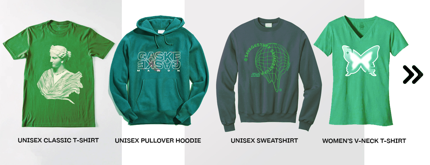
1. Placement Printing:
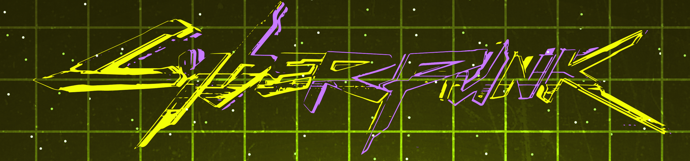
Placement or engineered print is the controlled position of an artwork within a product, designs can be printed as strategically placed pattern pieces across the printable area of the fabric.
✜ Examples of this printing type:
✜ Print File Guidelines:
File Type: .jpeg or .png
If you submit a JPEG with a white or another background color, guaranteed we will print the solid background. For .PNG artwork, we advise that you design in CMYK, then convert to RGB to upload to our Fulfillment System. When the design is printed with CMYK inks, it will be closer to your original image.
- In addition, the tee color may influence how a design will look when print due to the way the ink is absorbed by the fabric.. A design printed on a lighter tee may look a little lighter and darker color tees can have richer looking prints due to the white underbase applied during printing.
- Your design should include solid colors, as designs with lower opacity or partially transparent areas don’t always come out well with this printing method. Keep in mind that any transparent areas in your design will end up showing the color of the shirt. Example on a red shirt, transparent areas in the image will end up red and the same design on a black shirt would show black through.
- For adult shirts, a popular choice is approximately 2-2.5 inches high for each letter, with the name spanning roughly 8-12 inches across. This should make the name visible from a moderate distance.
- For children’s shirts, the name should be proportionately smaller, around 1-1.5 inches in height.
- Ink is more spread out and looks more faded on custom hoodies than t-shirts since hoodies are made from a thicker fabric. And due to the looser weave and combination of fabrics in tri-blends, DTG prints on tri-blend garments will have a vintage feel—the fabric will peep through the ink.
- We will also do our absolute best to have your print placed on the shirt the way you placed it, however, slight placement variations may occur.
- DTG printing is meant for complicated multi-color images, images with gradients, and details. It’s not the best option for large solid blocks of 1 color. Since some shirt fibers can punch through solid ink areas, it can dull down the color results.
- Avoid elements and fonts that subtly blend into the product color (e.g. a dark gray design on a black shirt). These can either blend in completely and not be visible on the product or print a halo with a hard edge.
DARK HEATHER T-SHIRT: Onscreen view |
Printed outcome |


Full Front Design Sizes
- The maximum printing area for DTG is 14×16″. However, we may scale down the print a bit to fit well (and look right) on smaller size shirts.
Left Chest Design Sizes
- The standard left chest size is typically 4” to 4” (4.5"x4.5") wide times your preferred height. It is suitable for formal and corporate purposes.
Sleeves Design Sizes
- For short sleeves, a small 3” x 3” size will work for most shirt sizes. If printing on smaller youth sizes, you may want to go down to 2 or 2.5” wide for these sizes.
To learn more about design sizing and placement, please contact our team.
2. All-over Printing (AOP) Printing:
For certain cut-and-sew products and all over graphic product, we recommend referencing our print templates to ensure your artwork is correctly placed.
✜ Examples of this printing type:
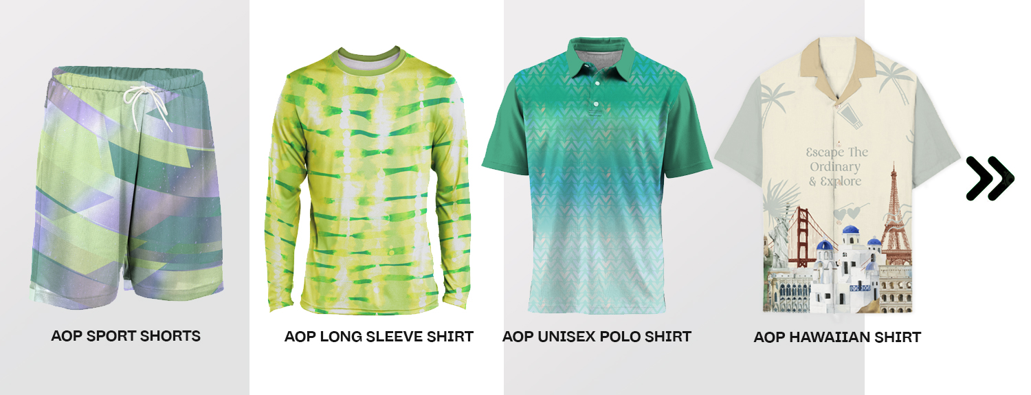
✜ Print File Guidelines:
- Use continuous designs that expand across the whole grey area.
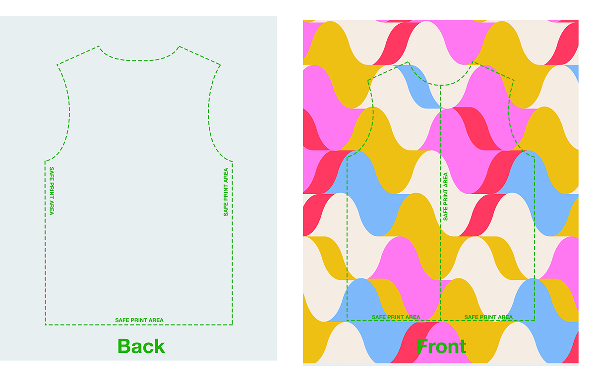
- The artwork should align seamlessly on all sides.
- Do not put important elements of the design near the collar or seams.
Does everything above sound a bit too complicated? If you need help with placement print development and set up, we will be happy to assist you with an artwork preparation and placement print layout development.
Please ask us for more information on the digital textile design services you can employ to get your prints looking great!